What’s the global data journalism community tweeting about this week? Our NodeXL #ddj mapping from February 25 to March 3 finds a @nytimes profile of its much admired data editor @amandacox; a flu tracker by @morgenpost; and a double dose of skepticism in @amandabee‘s roundup of bad data interpretations and @albertocairo‘s “How Charts Lie” book.
Meet Amanda Cox
In 2004, The New York Times graphics department asked internship candidates to critique charts it had published. Amanda Cox went the extra mile and redesigned all the test charts, which got her the internship. Fifteen years later, she is now the newspaper’s data editor. Times Insider wrote a nice profile story of her journey and work at The New York Times.
A lovely profile of the great @amandacox, who may be the sharpest thinker in the world about how to make data interpretible. If you’re interested in dataviz or data journalism, this is who you want to be when you grow up. https://t.co/3UrJTuCsb8
— Justin Wolfers (@JustinWolfers) March 1, 2019
Flu Tracker
Berliner Morgenpost is keeping track of the flu cases reported in Germany and comparing it to past years since 2008. To date, the current flu season, which started in October 2018, has recorded at least 84,587 cases.
New #dataviz which is updated daily: With our flu monitor, we track the flu in Germany and compare past seasons. #ddj https://t.co/6vUhRhXWQm pic.twitter.com/RkDuZCQk3Z
— Funke Interaktiv (@funkeinteraktiv) February 28, 2019
Doubt Your Data
Something to consider: Even N/A is data. Amanda Hickman rounded up story examples that illustrate the most common problems with relying on data, ranging from inconsistent data entry to cherry picking data.
We all know you should never trust data just because it's data, but this tipsheet from @amandabee proves it, featuring resources on dirty data, ethics, and more: https://t.co/8a0RAYJfgW #ddj #data #datajournalism pic.twitter.com/nlkwOyUXUB
— DataDrivenJournalism (@ddjournalism) March 1, 2019
Book: How Charts Lie
The upcoming “How Charts Lie” book by data viz expert Alberto Cairo is now available for pre-order. While visualizations can better inform us, Cairo’s book explores how they can also mislead us with poor design or incomplete and inaccurate data. He attempts to help readers better decode visual information by examining contemporary examples.
My new book, “How Charts Lie”, can be pre-ordered already. Pre-orders matter A LOT so if you've enjoyed my work in the past, please consider getting it: https://t.co/OaYQZwwLfo
—IndieBound https://t.co/ixdivyNKgb
—WW Norton https://t.co/lO32FvQiWR
—Amazon https://t.co/Fb2i8QspRU pic.twitter.com/66dV4bDMrq— Alberto Cairo (@albertocairo) March 4, 2019
Taxing Football
BBC News takes a closer look at corporation taxes paid by football clubs in the Premier League and the English Football League using public data, and examines whether football clubs should be treated differently from other businesses in terms of taxation.
Dass Amazon und Co. verdächtig wenig Steuern zahlen, ist ja wenigstens Thema inzwischen – aber wie ist es mit dem Profifußball? @BBCNews nimmt die Premier League unter die Lupe. #ddj https://t.co/5lI2rbObgZ via @puntofisso
— Jan Eggers (@JanEggers) March 5, 2019
Inflationary Alcohol
In the past eight years, alcoholic beverage prices in Turkey have increased at a much faster rate compared to the increase in salaries. Dokuz8Haber tracked and charted the increase against a teacher’s purchasing power. (In Turkish.)
Maaşı lira değil de bira ile almak istesek mümkün müdür?
Memleketin en iyi yatırım ürünü rakı ve bira oldu galiba…Verilerle alkollü içki fiyatları ve maaşlardaki değişim: Bira dahi lüks tüketime dönüşüyor https://t.co/G3cC8XJuB7
— Gürkan Özturan (@obefintlig) March 3, 2019
Bloomberg’s Big Data Team
From an initial team of six in 2012, Bloomberg’s data journalism team has now grown to 30 individuals spread across four cities and three continents. Its graphics and visual data executive editor Martin Keohan offers insight into the work they’ve produced.
A great shout-out on Digiday today for our @BBGVisualData Team, who produce some really great graphic-led articles on site covering various topics/sectors – including the Billionaires Index!https://t.co/E1IwbOeb1D
— Richard-Lee Read (@OMGitsRLR) February 26, 2019
Google Fellowships (Europe)
The European Journalism Centre is offering 40 summer fellowship placements to journalism, technology or design students in news organizations in 11 countries across Europe. The fellowships are funded by the Google News Initiative.
Hello, are you a student?Applications have *just* opened for the 2019 Google News Initiative fellowships and we're looking for a student to work on factchecking with @thejournal_ie for 8 weeks this summer https://t.co/Ks9KHw68Mw pic.twitter.com/aw87fS6Po1
— Christine Bohan (@ChristineBohan) February 19, 2019
Crowdsourcing Air Pollution Data
The results of Norddeutscher Rundfunk’s air pollution measurement campaign in the north of Germany are in. Using crowdsourced data collected last November, it created an interactive map where readers can search for the levels of nitrogen dioxide pollution in their area. The highest level of pollution was recorded in Hamburg, while the lowest was in Tönning. (In German.)
Was atmest Du? @NDRrecherche deckt auf, dass der Stickstoffdioxid-Grenzwert an 13 weiteren Stellen in Hamburg überschritten wird #MirStinkts #hhluft #wasAtmestDu https://t.co/FFeC8upfDc Ultra-Feinstaub-Problematik weiter ungelöst. Heute 21 Uhr #45MIN @NDR https://t.co/Xv0GxF0YKD pic.twitter.com/OmxdbcSxSF
— Bündnis MOBILITÄT (@Buendnis_Mobil) February 25, 2019
When to Use a Table?
Stuck on a data problem? Crowdsource some answers on Twitter! Here’s an example of Katherine Riley, a data journalist at Flourish, searching for answers from the data visualization community online.
Hey #dataviz friends 👋 Hit me up with your best reasons why – or situations when – to use a table instead of another type of chart!
— Kat(her)i(n)e Riley (@KatherineERiley) February 26, 2019
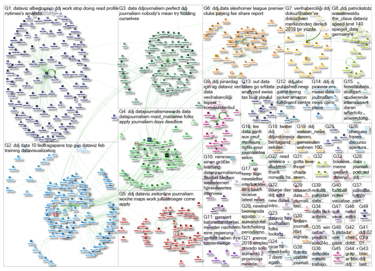
Thanks, once again, to Marc Smith of Connected Action for gathering the links and graphing them.
 Eunice Au is GIJN’s program coordinator. Previously, she was a Malaysia correspondent for Singapore’s The Straits Times, and a journalist at the New Straits Times. She has also written for The Sun, Malaysian Today and Madam Chair.
For a look at Marc Smith’s mapping on #ddj on Twitter, check out this map.