 Following the news of Rev. Martin Luther King Jr.’s assassination on April 4, 1968, long-simmering racial tensions exploded throughout Washington, DC. Four days later, 13 people were dead and more than 900 businesses were damaged. Many of the mostly black areas that were destroyed took decades to recover.
For the 50th anniversary of the riots, The Washington Post mapped the extent of the rioting throughout the city, plotting data compiled from declassified Secret Service reports and archival city planning documents, and mixing in archival photo and video along with modern-day interviews of people who experienced those four days in 1968 firsthand.
This was part of a larger newsroom-wide initiative, looking at 1968 as a transformative year in American history. Here’s how the team did it.
Getting and Cleaning the Data
The idea for the story began with a set of declassified Secret Service logs, which detailed calls made during the riots. These were obtained and compiled by Daniel Kryder of Brandeis University, and showed in real time how the chaos spread throughout the city.
However, we also wanted to give a sense of the actual damage in the wake of the riots. While researching to see what assets were available, we came across an image on Flickr that appeared to point out damaged buildings across the city. This led us to track down the publication the image was from — a damage assessment performed by the National Capital Planning Commission shortly after the riots.
We tracked down that damage report at the DC Historical Society and found that the publication not only had maps with point locations of citywide damage, but it also had footprints of buildings that were damaged or destroyed in three neighborhoods that were at the center of the riots.
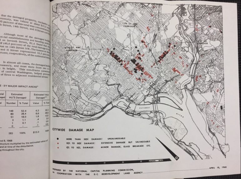
National Capital Planning Commission map of citywide damage from the riots.

Map of riot damage along H Street NE.
But we didn’t have shapefiles or GeoJSON to digitally map the destruction. We had a book. Books aren’t geo-referenced. So we applied one of our PostGraphics mottos: “Embrace the trace.”
In other words, we geo-referenced the images and traced the buildings to create our own shapefile of the data.
To do this, we used DC street shapefiles from Open Data DC to guide us in lining up the archival maps so that we could trace the buildings, and ended up digitizing everything in Adobe Illustrator using MAPublisher. If your projections are similar, this is a great way to digitize if you work faster in Illustrator. If the projections don’t align perfectly, ESRI ArcMap or QGIS are the best software options for geo-referencing purposes.
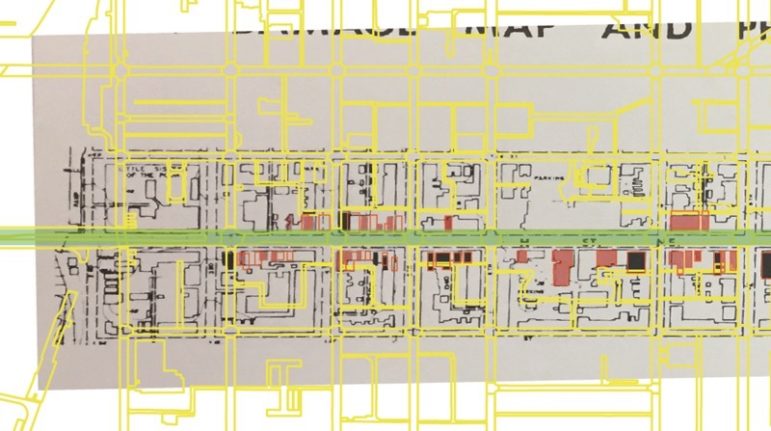
Yellow lines represent streets from Open Data DC and the green line represents H Street NE for reference.
Building and Designing the Page
Since we wanted our map to be interactive, and would be switching layers on and off to display relevant information as the user went through the story, we decided to display our maps using Mapbox.
We wanted to go for a look that matched the 1960’s “mid-century government-chic” aesthetic that we saw in so many archival government maps we found during our research. The design-change slider in Mapbox was a very useful tool for tracking subtle design changes to the base map as we iterated on and improved the design.
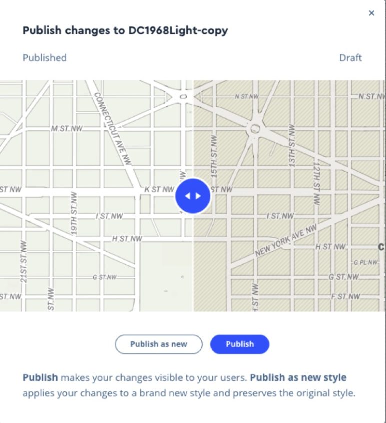
Changes in Mapbox between map versions.
Meanwhile, we also had some 3,000 Secret Service reports to go through. At first glance the data seemed pretty good — times and addresses were present in just about all reports, and they were even geocoded!
While the reports were geocoded, the first thing we needed to do was confirm that the geo-coding was in fact accurate.
Washington, DC, is divided into four quadrants, and the same street address can exist in multiple quadrants. There are four addresses at 1301 K St. in DC, for example — one each in NW, NE, SW and SE. So without a quadrant, you don’t necessarily know where an address is.
Unfortunately the quadrant wasn’t specified in about 500 Secret Service reports. To ensure that we were representing the data as accurately as possible, we had to discard these, since many possible addresses could overlap.
We analyzed the reports using a Jupyter notebook and geopandas. Using Jupyter is great because you’re essentially building a data workflow that you can revisit at any time (like writing this piece).
We grouped the reports by quadrant, and discarded any that did not have a quadrant specified. Then we mapped and did an intersect query to find reports that did specify a quadrant but had coordinates that fell outside of that quadrant. We had to try and re-geocode those.
Another quirk was that in 50 years, streets and addresses can change. We came across several intersections that didn’t seem to exist anymore. This was also a larger issue in general, as we could only map using existing map data — recreating the street grid of 1968 would have taken a little more time than we had for this project.
Once we had our data and maps in order, we worked to incorporate them into the narrative, alongside archival photos and video interviews with people who experienced the riots.
The goal for this piece was to create a visual timeline of the riots. Not only recounting the events and statistics of what happened, but also giving readers a sense of how DC looked and felt during those four days.
In that regard, the visual elements — maps, photos and videos — were particularly important to the storytelling process. We began by outlining seven distinct sections of the story and what each would touch on. From there we went slide by slide, identifying potential visuals for each point we wanted to make.
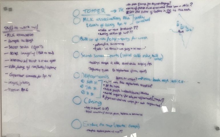
After doing research and collecting assets, we took stock of what we had and made a plan.
Although we live in a very different climate now, many of the underlying social issues that drove these riots are still in the public consciousness today. And we definitely tried to approach the archival content from that perspective. We were careful to include visuals that showed the riots from all perspectives and made sure to convey the outsized effect the riots had on mostly-black neighborhoods, many of which took decades to recover.
With all that in mind, we wanted to strike a balance between giving readers a sense of what it was like to be in DC 50 years ago while connecting it to the present day.
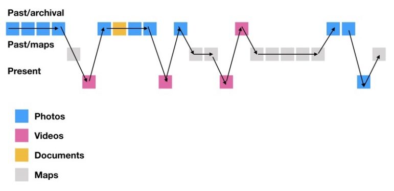
This diagram, created by Dan Zedek, Professor of the Practice at Northeastern University School of Journalism, shows the different components we used and how they wove together the past and present.
This story format — full screen visuals punctuated by shorter, corresponding blocks of text — evolved from previous stories that the Post Graphics team has worked on, including “Raising Barriers: A New Age of Walls” and “Sin Luz: Life Without Power.”
One of our earliest visions for the piece was to animate the Secret Service reports as time advanced in the map to show the impact — both physical and mental — of the unrest sweeping across the city. We used Mapbox’s data-driven styling to create rules that update the opacity and radius of the reports, giving the circles an expanding fading circle effect.
const strokeOpacityPaint = {

    property: 'start_time_stamp',

    stops: [

        [curTime - 1.5 * 60 * 60 * 1000 - 5, 0.2],

        [curTime - 1.5 * 60 * 60 * 1000, 0.1],

        [curTime, 1.0],

        [curTime + 1000, 0.0]

    ]

};

const radiusPaint = {

    property: 'start_time_stamp',

    stops: [

        [curTime - 1.5 * 60 * 60 * 1000 - 5, 3.0],

        [curTime - 1.5 * 60 * 60 * 1000, 8.0],

        [curTime, 1.0],

        [curTime + 1000, 0.0]

    ]

};

map.setPaintProperty(

    'secret-service-reports',

    'circle-stroke-opacity',

    strokeOpacityPaint

);

map.setPaintProperty(

    'secret-service-reports',

    'circle-radius',

    radiusPaint

);
The digitized building damage for the entire city was included as a separate polygon layer as well, using colors similar to those used in the 1960s maps we originally digitized the data from. This allowed us to turn the building layers on and off when we wanted to call out the destruction in certain corridors.
To emphasize the fact that these were actual buildings, we extruded the polygons a little bit to make them 3D map features. Then, when we called the animation to zoom to H St. NE, for example, we also changed the pitch property of the map to provide an oblique camera perspective.
We created parameters for each animation that would set different properties on the map. For the above-mentioned H St. NE example, this would set the map zoom to 15 (unless you’re on mobile), reposition the map, and adjust the pitch. In the callback of the animation, we show the damaged-buildings layer.
'h-st': {

    zoom: 15,

    mobileZoom: 14,

    center: [-76.990895, 38.900288],

    pitch: 35,

    callback: function(map) {

            map.setPaintProperty('damaged-buildings-polygon', 'fill-extrusion-opacity', 1.0);

    }

}
Creating the Print Version
Once we had the digital project published and out in the world, it was time to make the print version, with only about a three-day turnaround. We went to the whiteboard again and drafted up a series of options, and once we had a direction we felt comfortable with, we moved into Adobe Illustrator. In Illustrator, first we tested out layout options with quick screenshots from our Mapbox maps to make quick layout versions.
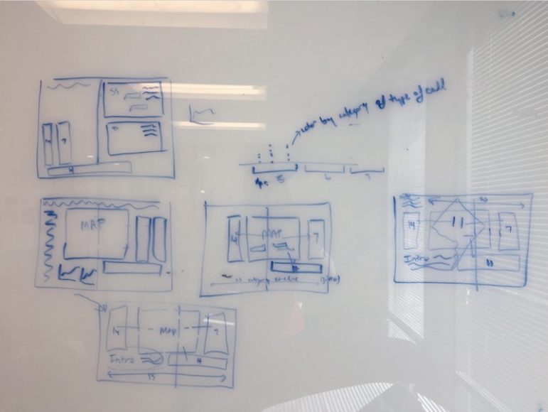
Mock-up versions of print version of the maps.
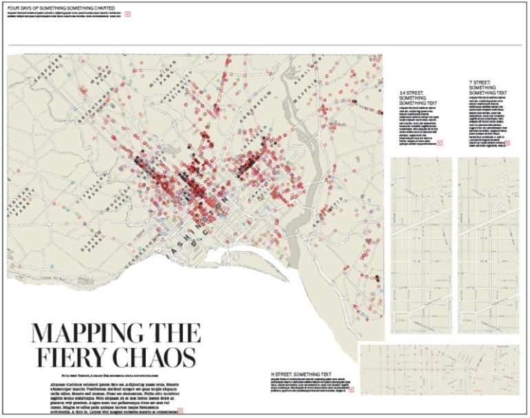
Rough mock-up of print version in Illustrator using Mapbox maps for quick design testing.
We wanted to carry the same style from the 1960s maps through to to the print piece as well, so we incorporated design aspects from the archival government maps, such as the beautifully cased streets, and orienting the map so north was tilted towards the top-left corner of the page. Rotating the map in this way allows for a bigger and more detailed map.
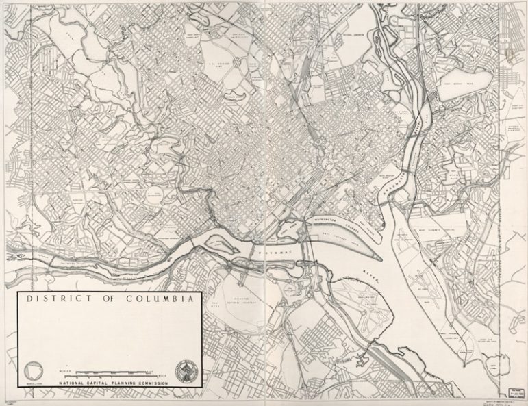
National Capital Planning Commission map of Washington, DC.
The final map took up the space of a full double truck (🚚🚚), or two-page spread, in the newspaper.
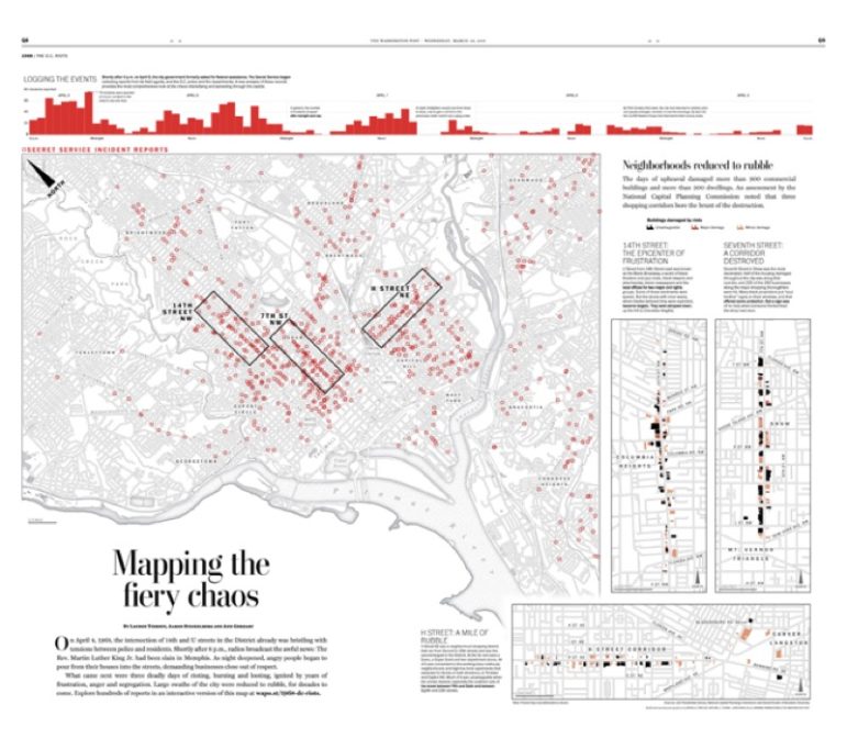 Since we didn’t have the luxury of animating the frequency of events in print, we included a timeline of the events along the top. In the print map we had to figure out how to simultaneously show the Secret Service calls as well as the destruction in the three most active corridors. We decided to map all of the calls on the large map with small inset maps for the three neighborhoods. The print map compilation was set up using MAPublisher, which allowed for easy reference of the neighborhood maps and pulling in the data for a quick turnaround.
A unique little touch we added to the map was the stylized north arrow, designed similar to the National Capital Planning Commissions map shown below on the left. Because we rotated the map, we wanted to be sure to make clear the orientation of the map, and this 1960s-styled north arrow seemed to do the trick.

On the left, the north arrow used on the 1960s National Capital Planning Commission maps. On the right, the north arrow we designed for our print version.
Collaborating Across Disciplines
One key thing to emphasize about this project is that it brought together visual storytellers from across the newsroom — video producers and editors, photo editors and reporters in addition to the core graphics team of cartographer, developer and designer. Ann Gerhart wrote through the piece and made sure we told a cohesive story. Rhonda Colvin and Zhiyan Zhong shot and edited the interviews and archival videos we used. Monica Newton helped to reign in the writers for the local section. Mark Miller was instrumental in diving back through the Post’s hefty archive of photos to find images used in the piece.
There were a lot of people who contributed to this effort, but one commonality among the core contributors was that we’re all visual storytellers with a variety of skills. Even though we each had our general specialties, everyone did a little bit of everything: conducted research, gathered assets, shaped the content and contributed to the presentation.
This approach speaks to what creates some of the most compelling visual storytelling these days — while team members may have complementary specialties, they’re actually capable of contributing in a number of ways outside that core competency.
This post first appeared on Source and is reproduced here with permission.
 Armand Emamdjomeh is a graphics reporter at The Washington Post. Prior to joining the Post, he was the Deputy Director of Data Visualization at the Los Angeles Times, and also worked on the L.A. Times Data Desk.
 Danielle Rindler is a graphics editor at The Washington Post, where she focuses on creating immersive, visual storytelling. She has played a crucial role in coordinating, developing and designing some of the newsroom’s most influential stories across multiple platforms. She previously worked as a designer at the Arizona Republic.
 Lauren Tierney is a Graphics Reporter at the Washington Post who enjoys telling stories with maps. Lauren also specializes in terrain representation, using open source visualization tools. She was previously a graphics editor at National Geographic Magazine, and has a masters degree in geography from the University of Oregon.
