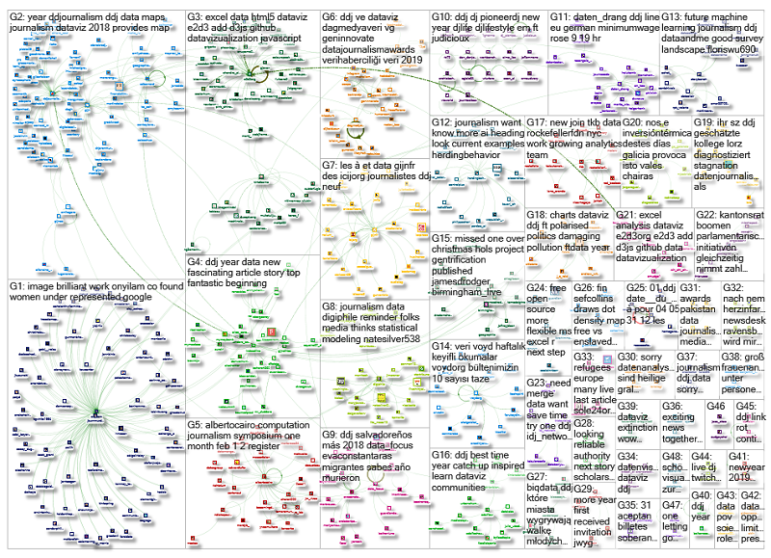
What’s the global data journalism community tweeting about this week? Our NodeXL #ddj mapping from December 31, 2018 to Jan 6, 2019 finds experts sharing their thoughts on machine learning in journalism with @storybench, @funkeinterativ and @webk1d‘s useful tool to merge datasets, @pewresearch‘s overview of female under-representation in online image searches, and an analysis by @EDHNoticias on corpses sent back to El Salvador.
Machine Learning in Journalism
Journalists can utilize machine learning as part of investigative reporting, or as a day-to-day tool to make repetitive tasks easier. Storybench gathered thoughts from experts in the industry about the advantages and pitfalls of using machine learning for journalism, whether it is truly necessary and the problem of algorithmic accountability.
🤖 Nice piece about using #MachineLearning in journalism — “The future of machine learning in journalism” https://t.co/SWMPioE8kz
— Colin Fay 🤘 (@_ColinFay) January 3, 2019
Analyzing Dead Bodies Sent Back El Salvador
El Diario De Hoy investigated repatriation data for deceased Salvadorans. Between January 2009 and March 2018, 1,248 bodies were repatriated to El Salvador. The leading cause of death: homicide, followed by traffic accidents.
El Salvador's Ministerio de Relaciones Exteriores helped repatriate 1248 bodies from 01/09 to 03/18. 200 of them were murdered — 109 of them while in transit to their destination & 90 once at destination https://t.co/YfR1QxApi9
— Elizabeth G. Kennedy (@EGKennedySD) January 3, 2019
Merge Datasets with One Tool
Looking to merge datasets? Funke Interaktiv and Webkid’s Geo Data Merger tool is an open source tool which can handle json, csv, geojson and topojson files.
🙌 We've build an open source tool together with @funkeinteraktiv that lets you merge datasets more easily: https://t.co/dNAligxFPL #ddj #reactjs pic.twitter.com/SPmunMyVyL
— webkid (@webk1d) December 18, 2018
Searching for Women Online
The Pew Research Center used machine vision to study and analyze gender in online image search results and then compare those results with real-world gender composition data in the workforce. Researchers found that women were underrepresented in online images, when compared to their actual participation rates in majority of the jobs examined.
How men and women appear in online job image searches https://t.co/P013NM5ZBY < This may not seem like a big deal, but it's a peek into some of the inherent biases that can creep into algorithms if we're not careful. pic.twitter.com/U5Sbxdcda8
— Ben M. Schorr (@bschorr) December 18, 2018
Data Journalism Handbook 2
Haven’t had time to read through the initial 21 chapters of the Data Journalism Handbook 2? You’re in luck, here’s a summary from AlJazeera Labs’ data journalist Mohammed Haddad, who shared 10 key takeaways from the book.
If you've been too time poor to read all 21 chapters of our beta Data Journalism Handbook 2, here's 10 key takeaways from @haddadme: https://t.co/8j66GehyTj #ddj #datajournalism #datahandbook
— DataDrivenJournalism (@ddjournalism) January 5, 2019
Compelling Arguments with Data
This 2017 presentation from Tableau research scientist Robert Kosara resurfaced. Here he is on the difference between storytelling and data presentation, as well as how to present data in a compelling way, with examples from the late Swedish statistician Hans Rosling.
Building a Compelling Argument with Data https://t.co/45Xkh7akOz #BigData #abdsc #DataScience pic.twitter.com/OSvSlqMn9W
— Marcell Nimfuehr (@marcnim) January 3, 2019
Illustrating National Railway Delays
BBC England’s charts illustrate the problems facing Great Britain’s train network, including the causes of delays over 32 years, the influence of staff shortages and the level of passenger frustration. The code (#Python scraper and #R analysis) and analysis of the story is on github.
BBC-Data-Unit/rail-fare-increases-2019 is a new repository by BBC England Data Unit: https://t.co/qW4I5asKjN
— News Nerd Repos (@newsnerdrepos) January 3, 2019
The Future of Data Analysis
This 2016 presentation by statistician Dr Edward Tufte has resurfaced online, thanks to Alberto Cairo. Here he is on the relationship between evidence, inference and conclusions: “Data analysis is about turning information into conclusions. Analytical thinking is about assessing and evaluating the relationship between information and conclusions.”
This talk by @EdwardTufte is a dense and concise refresher of this thinking and writings: https://t.co/hYtgWcQiO3 #dataviz #infographics #ddj pic.twitter.com/ftKixBF7iR
— Alberto Cairo (@albertocairo) January 3, 2019
Computation + Data Journalism Symposium
This gathering in Miami — a celebration and synthesis of new ways to find and tell news stories with, by and about data and algorithms — is just three weeks away. The symposium will include topics such as the human touch in automated fact-checking, photomation or fauxtomation, and using algorithms to investigate algorithms and society. Register here.
Excited to have @noUpside joining the line-up for Computation + Journalism next month in Miami. https://t.co/nAjXsPgl1N pic.twitter.com/yHc6lua5AE
— Nick Diakopoulos (@ndiakopoulos) January 3, 2019
Data Bulletin (in Turkish)
From interviews with data journalists to data journalism playbooks, the VOYD Veri bulletin will alert you to the latest tips and tools in the data journalism world, seen through Turkish eyes. Subscribe here.
VOYD Haftalık Veri Bülteni #11. sayısıyla yayında! Keyifli okumalar: https://t.co/DGCIvIcTVV#ddj #dataviz #açıkveri #opendata #datajournalism #verigazeteciliği #veribülteni #verigörselleştirme pic.twitter.com/nP6Z0dLP21
— VOYD (@voydorg) January 6, 2019
Thanks, once again, to Marc Smith of Connected Action for gathering the links and graphing them.
 Eunice Au is GIJN’s program coordinator. Previously, she was a Malaysia correspondent for Singapore’s The Straits Times, and a journalist at the New Straits Times. She has also written for The Sun, Malaysian Today and Madam Chair.

