What’s the global data journalism community tweeting about this week? Our NodeXL #ddj mapping from November 26 to December 2 finds @VRCCrimCam mapping London’s medieval murder hotspots, @geckoboard illustrating common data fallacies to avoid, @ddjournalism teases the beta launch of the Data Journalism Handbook 2.0, and @GoogleNewsInit displays its data journalism courses.
Mapping London’s Medieval Murders
Prof Manuel Eisner, who directs the Violence Research Centre at the University of Cambridge’s criminology department, took nine years to pore over surviving Coroners’ Rolls from the first four decades of the 14th century to figure out the trend of crimes way back when. Among the murders, one man was killed for throwing eel skins on the street for sale and another was killed for stealing a tunic.
This is a great project that combines thoughtful research, mapping, and…AND…the story of a man who was murdered in 1326 for throwing his eel skins on the ground in front of the wrong dudes. Some folks hate littering.
Something for everyone here:https://t.co/P7duybCuhQ
— Surprised Eel Historian (@greenleejw) November 28, 2018
Google’s Data Journalism Lessons
The Google News Initiative’s Training Center has 15 lessons on data journalism, ranging from learning how to diagram a disaster and its response to using tilegrams to visualize data. Have fun exploring!
Ücretsiz Veri Gazeteciliği Eğitimleri https://t.co/RNQJ5qJYmJ #açıkveri #verigazeteciliği #opendata #datajournalism #dataliteracy #ddj #vg #dataviz #verihaberciliği #veriokuryazarlığı pic.twitter.com/pVhVfel9xa
— Açık Veri Gazeteciliği PlatformuTR (@DagmedyaVeri) November 29, 2018
Data Fallacies to Avoid
This illustration on common mistakes when studying, analyzing and interpreting data may have been produced earlier in March but the advice is evergreen. Explore more on these common fallacies and real-life examples here. Want to pin up the poster in your workspace? Download it here.
An Illustrated Collection of Mistakes People Make When Analyzing Data – https://t.co/JQmR4lnvdE @geckoboard @DataScienceCtrl pic.twitter.com/mXIiDEpI0E
— ClearStory Data (@ClearStoryData) December 3, 2018
Beta Launch: Data Journalism Handbook 2.0
Looks like the beta version of the Data Journalism Handbook (Second Edition), by the European Journalism Centre in partnership with the Google News Initiative, will be launched online soon. Watch this space.
Psst! We've got some exciting news next week. Here's a hint: It's got something to do with the beta launch of the second #DataHandbook! Keep tuned and read up on the first edition here: https://t.co/1SwR7pnIIo #ddj #datajournalism @ejcnet pic.twitter.com/tkiaYx9qCU
— DataDrivenJournalism (@ddjournalism) November 27, 2018
Hungarian Media Monopoly
Last week, 476 media outlets became parts of a new Hungarian media holding controlled by pro-government forces. Center for Media, Data & Society fellow at the Central European University, Attila Bátorfy prepared an infographic to show how the ownership of these outlets have changed. (In English and Hungarian)
It is a sad development in #Hungary that nearly all of the Hungarian #press will be under one Foundation. Press may look free on the surface, but it is resembling a monopolistic market. https://t.co/YbMx6KQZKC via @atlatszo
— Géza Kovács-Dobák (@GezaKovacsDobak) December 4, 2018
UK: Uncounted Homeless
An investigation by HuffPost UK showed that the government was providing data on nationwide levels of homelessness by using a rough count on just one night of the year in autumn, resulting in largely inaccurate data.
An investigation by @emmayoule shows the govt uses “snapshot” rough sleeper counts on just one night of the year in autumn to provide data on the nationwide levels of homelessness. That means some areas officially have zero homeless people. https://t.co/WEEZS0Bemz
— Jess Brammar (@jessbrammar) November 21, 2018
AI and Journalism
In an era where artificial intelligence is becoming more and more a part of communication processes and decisions, journalism has to cope with adopting automated processes in news production and using AI responsibly. Hans-Bredow-Institut researcher Wiebke Loosen writes about the advances in robot journalism. (In German)
"Wir sollten technologischen Lösungen, die für die Herstellung von #Öffentlichkeit und #Meinungsbildung relevant sind, so wertschätzend-kritisch begegnen wie dem #Journalismus selbst". #ArtificialIntelligence @WLoosen im Magazin Tendenz der @BLM_Bayern https://t.co/GMqQj3Ixmr
— Hans-Bredow-Institut (@BredowInstitut) November 28, 2018
Turkey: Educating Syrian Kids
The European Union has been promoting the integration of Syrian children into the Turkish education system since the influx of Syrian refugees in Turkey. Dokuz8haber analyzes the data to gauge the success of these efforts. (In Turkish)
Suriyeli ailelerin bir bölümü “asimilasyon” endişesiyle, bir kısmı ise mali ihtiyaçlar nedeni ile çocuklarının okula gitmesine sıcak bakmıyor.#dokuz8veri Haber Merkezinden @ramadura ve @metinbelgesi derledi.https://t.co/TcpZrCWJbk pic.twitter.com/QQP0l1cufp
— dokuz8HABER (@dokuz8haber) November 28, 2018
Barcelona’s Economic Inequality
Barcelona’s two districts Pedralbes and Ciutat Meridiana may only be a bit more than 10 kilometres apart, but their economic wealth has a gap as wide as New York’s compared to Medellin. Fundació Periodisme Plural shows the state of economic inequality in Spain’s capital city using infographics. (In Catalan).
Quin és el barri + ric de Barcelona? Quin té + habitants sense estudis? I més atur? On hi ha + estrangers no europeus? Un infogràfic per comparar els barris de la ciutat i veure com de desiguals són https://t.co/YpCE8DDycf @d3js_org #ddj #dataviz @CatalunyaPlural @revistaxq_cat pic.twitter.com/awYZwEOoVT
— Victòria Oliveres (@VictriaVic) November 27, 2018
German Judicial Districts
Spiegel Online’s Marcel Pauly uploaded data on the judicial districts in Germany that have existed since 2013, which had been used for a story looking into which district hosted Germany’s toughest judges.
Toll: @Datawrapper hat unsere Geodaten zu Gerichtsbezirken (https://t.co/lkYtElYgUn) als Kartenvorlage übernommen.
Nicht so toll: Welche Karten lass ich denn jetzt im #ddj-Seminar an der @Nannenschule bauen? Was hat Sinn und existiert noch nicht als Vorlage? 🤷♂️
— Marcel Pauly (@marcelpauly) November 26, 2018
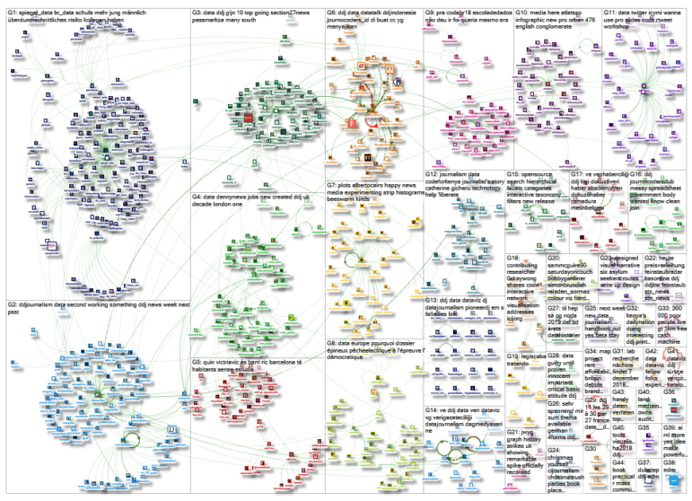
Thanks, once again, to Marc Smith of Connected Action for gathering the links and graphing them.
 Eunice Au is GIJN’s program coordinator. Previously, she was a Malaysia correspondent for Singapore’s The Straits Times, and a journalist at the New Straits Times. She has also written for The Sun, Malaysian Today and Madam Chair.
For a look at Marc Smith’s mapping on #ddj on Twitter, check out this map.