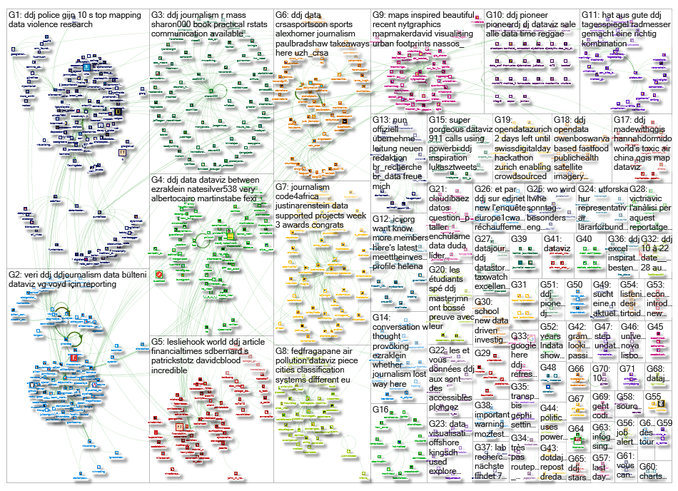
What’s the global data journalism community tweeting about this week? Our NodeXL #ddj mapping from October 22 to 28 finds @NateSilver538 talking about election forecasting, @BBCNews highlighting the prevalence of fast food outlets in the UK, @washingtonpost comparing how tough it is for Americans to vote by state, and @business and @HowWeGetToNext on battling for fresh air in India and Europe.
Nate Silver on Election Forecasting
Ezra Klein talks to FiveThirtyEight founder Nate Silver about how he builds his forecasting models, whether there’s a purpose to predicting election outcomes, which campaign reporters he reads and whether Trump is the favorite for 2020.
A conversation between @ezraklein and @NateSilver538. These gentlemen are among journalism's great writers and great thinkers. Two of my absolute favorites! Check out their discussion: https://t.co/RaeNc2Mq8z #DataScience #BigData #dataviz #Midterms2018 #TuesdayThoughts #podcast pic.twitter.com/W2LDcoaYuW
— Sean Gardner (@2morrowknight) October 23, 2018
The High Cost of Pollution in India
Bloomberg profiles India — home to the world’s 10 most polluted cities. The country’s air pollution has been linked to ailments from asthma to heart disease and lung cancer, contributing to the deaths of more than 1.1 million Indians in 2015. Healthcare fees and productivity losses from pollution also cost India as much as 8.5 percent of GDP, amounting to about $221 billion every year.
Delhi vs. Beijing. Capital vs. Capital. Mano y Mano.
When it comes to dirty, unbreathable air, the Indian capital takes it like a boss.https://t.co/jR8PekkAfa pic.twitter.com/aH57vQfL7f
— David Ingles (@DavidInglesTV) October 22, 2018
UK’s Growing Fast-Food Outlets
Despite UK town halls trying to limit the spread of fast food outlets, figures from the Office of National Statistics show that the UK has seen a 34 percent increase in such outlets from 2010 to 2018. BBC highlights research that suggests people most exposed to fast food are nearly twice as likely to be obese.
UK high streets have the highest concentration of fast food outlets in almost a decade, and let’s not forget deprived areas have x5 more fast food outlets https://t.co/t9HqkQfEYm
— Dr Sue Reeves (@DrSueRNutr) October 23, 2018
How Easy Is It for Americans to Vote?
Washington Post created an interactive for Americans in each state to find out how easy or difficult it is to exercise their right to vote based on voting registration, restrictions, requirements and wait times. These factors affect the voting turnout and may even discourage people from voting.
A guide to voter registration for every state. From registration dates to purge rates and photo ID requirements. By @dataKateR and @KevinUhrm https://t.co/IZ0ZsamGQc pic.twitter.com/CrvXAFYPbL
— Andrew Ba Tran (@abtran) September 19, 2018
Turkey’s New Data Bulletin
Turkey’s Data Literacy Association now produces a weekly bulletin with updates on data literacy, open data and data journalism developments around the world. Subscribe here. The association also held their first general assembly just last week, here’s their recap. (In Turkish)
📰Veri Bülteni: VOYD'dan .@voydorg Veri Okuryazarlığı İçin Güncel Veri Bülteni!💹✨👷♀️! https://t.co/ZhyTlD3AIP #ddj #dataviz #vg #dataliteracy #verihaberciliği #veriokuryazarlığı pic.twitter.com/vfibvVXmXe
— Açık Veri Gazeteciliği PlatformuTR (@DagmedyaVeri) October 22, 2018
UX Knowledge Base Sketches
UX (user experience) designer Krisztina Szerovay regularly draws UX knowledge base sketches, covering a wide range of topics, from cognitive bias to data modeling.
My newest UX Knowledge Base Sketch is the second part of the UI Animation series, check out the article for recommended readings, links:https://t.co/eYsGNSYtst
Link to the first part:https://t.co/ciEtsP23Mg#ux #uxdesign #uianimation #animation #sketchingforux #uxsketch #ixd pic.twitter.com/DihQahRGg6
— Krisztina Szerovay (@krisztaszerovay) October 25, 2018
Kampala’s Swamp City
The annual Uganda WASH Media Awards just honored excellent reporting on Water, Sanitation and Hygiene (WASH). Top prize: @Code4Africa’s supported #ddj project Swamp City on how urbanization destroyed a critical Kampala wetland, written by Annika McGinnis and Fredrick Mugira. By the way, Code4Africa has vacancies for part-time data journalism trainers.
Great news: @Mugira + @annikam93 receive Uganda's 2018 #WASHAwards for outstanding journalism, using imagery from @AfricanDRONEorg and @googleearth
Read Swamp Story:https://t.co/0s1As0Hwi2
(The 4th win for @Code4Africa supported data/drone #ddj projects this week!) pic.twitter.com/zkJsz7jEpb— Code For Africa (@Code4Africa) October 27, 2018
The Battle for Fresh Air in Europe
National governments frequently conspire to block pollution restriction measures that would undeniably save lives. Corin Faife discusses the efforts made by EU states to reduce air pollution and their shortcomings.
@InfoVizCritique #MSCI6140 https://t.co/P1Pv0HDPBT a couple of stylish visualizations here – I especially like the design of the classification system comparison. The "twisting" effect emphasizes frequency effectively without being distracting (content is king).
— Alic Szecsei (@aszecsei) October 24, 2018
Young Lives in Grand Est
Webullition analyzed which areas in the Grand Est region of France attract more young people between the ages of 15 and 29, and the factors influencing the young population to settle in these areas. (In French.)
Les étudiants de la spé #ddj du @MasterJMN ont bien bossé, la preuve avec leur première production ! https://t.co/6pGDqG54Cr
— Raphaël da Silva (@Raphipons) October 26, 2018
Talking Data Journalism with Reuters Institute Fellow
“Data gives us facts, and this is ever more important in times of fake news,” Reuters Institute for the Study of Journalism fellow Bettina Figl on data journalism said in the Tüv Nord Group #explore series. (In German.)
Wird im Profi-Tennis betrogen? Bekommt mein Hausarzt Geld von der Pharmaindustrie?
Journalisten gehen dem mit der Auswertung großer Datenmengen auf den Grund. Warum das in Zeiten von #FakeNews so wichtig ist, erklärt Journalistin @BettinaFigl auf #explore. https://t.co/vFtFxAgcFS— TÜV NORD GROUP (DE) (@tuevnord) October 17, 2018
Thanks, once again, to Marc Smith of Connected Action for gathering the links and graphing them.
 Eunice Au is GIJN’s program coordinator. Previously, she was a Malaysia correspondent for Singapore’s The Straits Times, and a journalist at the New Straits Times. She has also written for The Sun, Malaysian Today and Madam Chair.

