What’s the global data journalism community tweeting about this week? Our NodeXL #ddj mapping from October 15 to 21 finds @Esri’s @AllenCarroll talking the power of maps in storytelling, @visualizingdata’s catalogue of charts and corresponding tools to help information designers, and @ericwilliamlin’s deep dive into the data of casting decisions in Shakespearean plays since the 1900s.
How Maps Reveal Hidden Stories
Since he was a child, Allen Carroll has always loved maps. Now program manager for storytelling at Esri, Carroll grew up staring at world maps, gas station maps, and even drew all sorts of elaborate maps by hand. Here he writes his first piece in a series of reflections on the power of maps and storytelling. (Disclosure: GIJN has an agreement with ESRI which allows us to provide free mapping software for GIJN members.)
Thanks @AllenCarroll for your article. I too drew elaborate maps as a kid ! https://t.co/DSpWIUoslJ
— josephkerski (@josephkerski) October 19, 2018
Shakespearean Ambitions
What does the future hold for aspiring Shakespearean actors? Apparently, if you’re an actress who wants a starring turn in Shakespeare’s plays, you’d pretty much have to do so before you turn 40. Composer-turned-coder Eric William Lin took a deep dive into the data from more than 1,000 productions of Shakespearean plays between 1900 and 2018 and discovered how age, gender and race affect casting.
Alright, gotta vote for @ericwilliamlin with his Shakespeare casting piece bc @dgmllr and I have been v into Shakespeare lately and the viz came at a v relevant time and I love theater and also IT IS SO GOOD. https://t.co/XwBII2GNE2
— Sarah Kay Miller (@thesarahkaym) October 20, 2018
Chartmakers’ Directory
Andy Kirk’s chartmaker directory is a catalog of charts and corresponding tools that will help information designers answer the most common question in data visualization: “Which tool do you need to make that chart?”
Thanks to @jonathandrummey for this excellent Tableau tutorial for creating Marimekko charts. https://t.co/vPcMJlfuRj
Also, a tip o' the hat to @acotgreave for adding it to my Chartmaker Directory.https://t.co/zCyf0ALKMv
— Andy Kirk (@visualisingdata) October 17, 2018
Mapping Police Violence
Mapping Police Violence is a research collaborative collecting comprehensive data on police killings across the United States in order to quantify the impact of police violence in communities.
This is wild and heartbreaking. #policeviolence #publichealth https://t.co/X0rsHnzJld
— Traci Carson (@Traci_Carson_) October 24, 2018
Breathing Polluted Air
Financial Times reports on how air pollution is killing residents in urban cities around the world. Fine particles in polluted air contributes to 7 million premature deaths worldwide, estimates the World Health Organization. And eight in 10 people in the world are breathing polluted air above the WHO’s safe limit.
Not hard to spot the world's most polluted continent, and no great surprises, just as the pollution season begins, that north India is one big smoggy slice of black….. https://t.co/OPBIhM6ihn pic.twitter.com/xeGR93VwGJ
— james crabtree (@jamescrabtree) October 19, 2018
Mapping Every Building in the US
The New York Times mapped almost every building in the United States, showing the built legacy of the country. The images are drawn from a huge database that Microsoft released to the public this year. The company’s computer engineers trained a neural network to analyze satellite imagery and then to trace the shapes of buildings across the country.
Beautiful and beguiling. The layering of place and the spaces between.
Maps in which we lose and find ourselves https://t.co/au9vDOoyDG— Rebecca Robins (@robins_rebecca) October 23, 2018
Ask the Question, Visualize the Answer
The questions you ask before visualizing data will help you figure out what charts to use. Nathan Yau writes an insightful blogpost on how one dataset can be visualized in many different ways depending on the questions you ask it.
This is a great piece demonstrating how some simple data can be illustrated in countless ways to answer different questions.
There is no single chart that can show every dimension of even the simplest data set. It's up to us to decide how to show it.https://t.co/sLFSZk6q5K
— Frank Donnarumma (@Frankman1000) October 18, 2018
Observe, Collect, Draw
Statistician Nathan Yau gives information designers Giorgia Lupi and Stefanie Posavec’s #ObserveCollectDraw book some love in his blog post. He describes what you can do with this visual journal for data and labels it as fun!
Like journaling and #dataviz? Create your own visual journal of data! @flowingdata describes @_deardata's delightful "Observe, Collect, Draw!" book. https://t.co/1aTiRDsfua #data #journal pic.twitter.com/lk9FLdZCul
— Michelle Homes (@HomesAtMetacoda) October 17, 2018
Visual Perception in Visualization
Data Stories Podcast speaks to scientist Steve Haroz on visual perception in data visualization. Haroz urged information designers to make decisions based on empirical research, not just assumptions about best practices.
Interesting podcast @datastories and @sharoz for people interested in #InfoVis & #datavis about visual perception. It will give you a good base to debunk most pseudo-scientific myths about visual perception out there.https://t.co/j8V6Eq6PfW#visualization #datadesign #design
— Nikita Jerschov (@NikitaJer) October 16, 2018
Shortlist: Information Is Beautiful Awards
The Kantar Information Is Beautiful Awards shortlist is out and it’s full of gorgeous and inspiring infographics and data visualizations. Winners will be revealed at an awards ceremony on December 4, 2018 in New York.
Well that was a tough job…just finished judging the @infobeautyaward shortlists. Full of wonderful and varied #dataviz #infographics #maps #design https://t.co/bY73ugeT4Q Good luck to all pic.twitter.com/EMSD987eSp
— Nigel Hawtin (@nigelhawtin) October 15, 2018
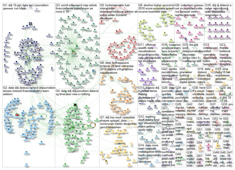
Thanks, once again, to Marc Smith of Connected Action for gathering the links and graphing them. Editor’s Note: GIJN removed an item that ran in an earlier edition of this story, on emerging words from Google Search, after GIJN we were alerted that the item was inaccurate and prematurely released. We have substituted the Financial Times’ report on air pollution in its place.
 Eunice Au is GIJN’s program coordinator. Previously, she was a Malaysia correspondent for Singapore’s The Straits Times, and a journalist at the New Straits Times. She has also written for The Sun, Malaysian Today and Madam Chair.
For a look at Marc Smith’s mapping on #ddj on Twitter, check out this map.