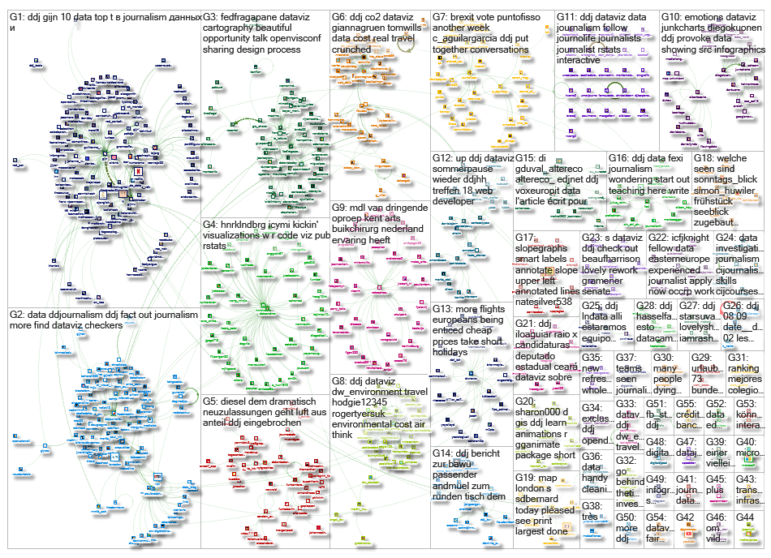
What’s the global data journalism community tweeting about this week? Our NodeXL #ddj mapping from Aug 27 to Sept 2 finds @nytclimate personalizing climate change, @npr fact-checking the US Education Department’s school shooting data, @dwnews calculating the cost of travel to the environment, and @junkcharts dissecting the strengths of Thailand cave rescue data visualizations.
Climate Change, Personalized
The world is warming up because of human-induced climate change. But how much has it heated up in your hometown? See the effects of climate change, personalized, in this New York Times interactive.
This great tool shows how much warmer ur town became since u were born & what to expect in the future (days greater than 90F/32C). I used it to graph how major #Pakistan🇵🇰 cities have and will heat up🌡️.#Karachi #Lahore #Peshawar & #Quetta sizzile🔥.https://t.co/TS6ET9j1BW pic.twitter.com/KnTwp9wu8v
— Adil Najam عادل نجم (@AdilNajam) September 1, 2018
Fake News in School Shooting Numbers
This spring the US Education Department reported that in the 2015-2016 school year, “nearly 240 schools … reported at least 1 incident involving a school-related shooting.” NPR fact-checked this claim and found that more than two-thirds of these reported incidents never occurred.
With rare events, data errors can dominate the real signal: We've seen this with voter fraud, here with school shootingshttps://t.co/1gq1it2MnW pic.twitter.com/U4cAzrTbmX
— Dean Eckles (@deaneckles) September 4, 2018
Russia-Ukraine Trade
Over the past four years, Ukraine radically reduced exports of goods to Russia and increased sales to the EU. GIJN member Data Journalism Agency (Texty.org.ua) analyzed the trade export data.
Експорт здорової країни. Україна радикально зменшила продажі в Росію і збільшила в ЄС | Тексти для думаючих людей https://t.co/Gwp5smqG7K через @TextyOrgUa
— Майор Плантаго (@lazyukrop) September 1, 2018
Airport Crimes
The crime rate at or close to airports in England and Wales has doubled in two years, and passengers travelling with banned items like CS spray, knives and air rifles are partly to blame for the statistics. Check out GitHub for how the BBC extracted relevant data from 1600 CSVs.
There's now a GitHub repo for this story https://t.co/Uab4IJIv1n including an explanation of how I used command line to extract relevant data from 1600 separate CSVs https://t.co/IYpGGt59Aq #ddj
— Paul Bradshaw (@paulbradshaw) August 29, 2018
Cost of Travel: Trains vs Planes
Are planes really the fastest and cheapest way to travel? DW ran the numbers, taking into account transit time and environmental damage, and found several routes the train gives the plane a run for its money. It also reveals how the numbers would change if we were to pay for the environmental consequences of travel.
What's the real cost of travel? @TomWills crunched data for us on journey time, CO2 emissions, ticket prices and the social cost of carbon for six routes across Europe: Trains almost always beat planes https://t.co/BiD9a0QQvh #ddj #dataviz pic.twitter.com/TKv1cs9BvH
— Gianna Grün (@giannagruen) August 29, 2018
Thai Cave Rescue Dataviz
The story of 12 boys and their coach trapped for 17 days inside a flooded cave in Thailand in July caught worldwide attention, triggering attempts by media outlets to explain the rescue operation with data visualizations. Kaiser Fung analyzes the strengths of these visualizations.
.@junkcharts showing an *emotional" data visualizing of the Thai cave rescue operation:
(src: https://t.co/beAPkKgR44)#DataViz #Emotions #StoryTelling #ddj#SST18 pic.twitter.com/YV8mQX66bh
— Prof. Diego Kuonen (@DiegoKuonen) August 28, 2018
Dataviz Without Coding
Turn your data into stories without writing code using DIVE. A data exploration tool, DIVE combines recommender systems with point-and-click interactions for easy data visualization and analysis. It is a publicly available open source research project from the MIT Media Lab.
Another #dataviz resource for your toolbox. DIVE from @medialab offers semi-automated visualisation recommendations, point-and-click statistical analyses, and more: https://t.co/Y8rrQ0x7nS #ddj #datajournalism pic.twitter.com/HIKHvqKvgY
— DataDrivenJournalism (@ddjournalism) August 27, 2018
Free Data-Driven Storytelling Book
The Data-Driven Storytelling book, edited by Nathalie Henry Riche, Christophe Hurter, Nicholas Diakopoulos and Sheelagh Carpendale, is free to read for one more week online!
Our Data-Driven Storytelling book is free for the next two weeks online: https://t.co/SL9t4RG0Ff
— Nick Diakopoulos (@ndiakopoulos) August 29, 2018
Business Economy in Spain
The Vodafone Observatory created a tool to show how business in Spain has evolved from 2008 to 2017 and which sectors have grown according to different regions.
¿Cuántas empresas hay en tu comunidad? ¿Cuántos empleados hay por sectores? ¿Donde se ha crecido más en estos años? Guarda un ratito para cotillear el mapa interactivo del sector empresarial [https://t.co/C5CJd8ja8v] #ObservatorioVodafone pic.twitter.com/DcMNCds6Jb
— Vodafone España (@vodafone_es) September 2, 2018
Candidacy Analyzed
Ilo Aguiar, a PhD researcher in Digital Media at UT Austin|Portugal Program, did a data deep dive on 590 Tribunal Superior Eleitoral state deputy candidates in Ceará, Brazil.
1 em cada 4 candidatos milionários é filiado ao PDT, mas o maior patrimônio declarado é de Denise Regadas, do PSL, com mais de 23 milhões de reais. #Eleições2018 #Deputadoestadual #CE #Ceará https://t.co/mEcAW0dFuI
— Caroline Ribeiro (@carolineribeiro) August 27, 2018
Thanks, once again, to Marc Smith of Connected Action for gathering the links and graphing them.
 Eunice Au is GIJN’s program coordinator. Previously, she was a Malaysia correspondent for Singapore’s The Straits Times, and a journalist at the New Straits Times. She has also written for The Sun, Malaysian Today and Madam Chair.

