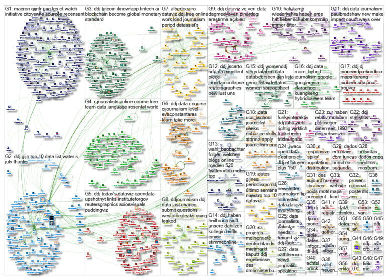
What’s the global data journalism community tweeting about this week? Our NodeXL #ddj mapping from July 23 to 29 finds @NadiehBremer visualizing beautiful constellations imagined by different cultures, @mslima diving deep into why we love pie charts, @leigh_tami18 explaining the various methods of joining datasets, and the Reuters Graphic’s team visualization of a dam disaster in Laos.
Same Sky, Different Figures
Nadieh Bremer has created gorgeous interactive visualizations of how different cultures imagine different constellations from the same stars in the sky.
Data science meets comparative anthropology and history of astronomy across Chinese, Maori, Egyptian, Greek and many other older cultures. One of those blog posts that gives you a ton of perspective https://t.co/gl6VQkzpkk pic.twitter.com/RRsFrOJGWV
— Akin Unver (@AkinUnver) July 24, 2018
Why Humans Love Pie Charts
Statistician and computer scientist Leland Wilkinson said that pie charts “have been reviled by statisticians (unjustifiably)” and “adored by managers (unjustifiably).” Here, Manuel Lima, a design lead at Google, takes a look at historical and evolutionary perspectives of why pie charts are popular despite their shortcomings.
Great writeup about pie charts by @mslima #dataviz “Why humans love pie charts” @mslima https://t.co/rWDQiayKC2
— John A Guerra Gómez (@duto_guerra) July 24, 2018
Joining Datasets
City of Cincinnati Chief Performance Officer Leigh Tami used drawings of a person wearing a coat to explain the joining of two data sets and when to use each: left join, right join, inner join or outer join.
it’s Monday & I’ve already depleted my patience quota for the entire week so I made a drawing of a person wearing a coat to explain when to use different data joins pic.twitter.com/GjI4vMET1R
— Leigh Tami (@leigh_tami18) July 23, 2018
Testing Stories on Mobile
With readers increasingly spending more time on mobile devices, it is extremely important to test your storytelling and data visualization on mobile platforms. Data journalist Angelo Zehr’s tutorial teaches you how to emulate different smartphones on your computer without the need to buy any devices.
How to test your #ddj mobile storytelling if you don't have access to different smartphone devices:https://t.co/nunl2zGvHn
Our latest #tutorial – this time in english #android #iOS— SRF Data (@srfdata) July 26, 2018
Building a Slackchat Tool
Politico’s Jon McClure and Lily Mihalik share the philosophy, design and front-end-focused parts of building Politico’s open-source Slackchat tool.
So great to hear from @mazet and @JonRMcClure about their open source work w/ @politico: imagining the widest possible scope before you start, regularly burning your prairies, feedback on short deadlines, and lots of other advice. https://t.co/HFoJwbqOfw
— OpenNews Source (@source) July 25, 2018
Visualizing a Dam Collapse
A dam collapsed in a remote part of land-locked Laos, sending a torrent of 500 million cubic meters of water downstream. The wall of water tore through low-lying villages and flooded large areas. Reuters Graphics visualizes how the Laos dam disaster unfolded.
Excellent piece on the #LaosDamCollapse by @ReutersGraphics https://t.co/zPZys2CgDk #ddj pic.twitter.com/ONwKMNmxvK
— Joshua Stevens (@jscarto) July 26, 2018
Quantifying Data Journalism’s Impact
Is all impact good impact? And how do you quantify it? Paul Bradshaw discusses the different types of impact data journalism can create, in an extended extract from the forthcoming second edition of the Data Journalism Handbook.
"Counting the uncounted is a particularly important way that data journalism can make an impact — indeed, it is probably fair to say that it is data journalism’s equivalent of ‘giving a voice to the voiceless’."https://t.co/Vzrj97Rxlo via @wordpressdotcom
— Lívia Vieira (@_Livia) July 23, 2018
Pakistan’s Women Power
In a data-driven analysis, journalist Abdul Salam Afridi found that women in Khyber Pakhtunkhwa, an administrative province in Pakistan, were outperforming their male counterparts. On average, the female assembly members pushed through twice as many resolutions from 2013 to 2018.
Investigation into #genderdata by @internews #ddj alum @asalamafridi reveals that the small number of female in Khyber Pakhtunkhwa assembly are driving through local level social service legislation. Check out story and @Datawrapper viz #Pakelections2018 https://t.co/IkqrDmBZRc
— Eva Constantaras (@EvaConstantaras) July 25, 2018
Recycling Plastics Performance
According to the European Commission, Europeans buy some 49 million tons of plastic every year and throw away half of it – 27.1 million tons of plastic were discarded in 2016. While some European countries are recycling much of their plastics, others are lagging behind, including countries such as the United Kingdom, France, Italy and Spain. (In French.)
La France affiche des taux de recyclage des emballages très inférieurs à la moyenne européenne https://t.co/q6Gfyscxob @AlterEco_ @AntoineRavignan pic.twitter.com/gYNNDjCglI
— European Data Journalism Network (@EdjNet) July 30, 2018
Course: How to Find Great Stories in Data
Have you signed up for Knight Center’s Intro to R for Journalists course yet? It’s not too late to catch up with Andrew Ba Tran’s teachings. The material you’ll need to get a sense of all the possibilities for programming in R is neatly organized in this website.
Thanks, once again, to Marc Smith of Connected Action for gathering the links and graphing them.
 Eunice Au is GIJN’s program coordinator. Previously, she was a Malaysia correspondent for Singapore’s The Straits Times, and a journalist at the New Straits Times. She has also written for The Sun, Malaysian Today and Madam Chair.


