Screenshot from Vox
What’s the global data journalism community tweeting about this week? Our NodeXL #ddj mapping from January 15 to 21 finds an interactive @voxdotcom piece on US school districts which are reducing or perpetuating racial segregation, several data-related good book recommendations by @stephencredmond and @Gapminder, a Digitizing Istanbul project by @DagmedyaVeri, and a podcast discussion of memorable visualizations between @michelle_borkin and @datastories.
Gerrymandering the US School System
Vox’s report shows that racial segregation remains in US schools, more than 60 years after the Supreme Court declared school segregation unconstitutional. Groups with political clout — mainly wealthier, whiter communities — have pushed policies that help white families live in heavily white areas and attend heavily white schools.
Love the way this @voxdotcom interactive on segregation in school districts helps the user see the problem with multiple approaches: Maps, bar charts, scatter plots, little people gerrymandering thingies, etc. https://t.co/5jUCfMm1bf pic.twitter.com/5mdnUloceI
— Ryan Sholin (@ryansholin) January 23, 2018
Mapping Right-Wingers
Rechtes Land is an atlas about right-wing structures and activities in Germany. Places of neo-Nazis and other extreme right-wingers, their associations, their murders, their raids and parades are mapped here.
2.355 rechte Kommunalmandate gibt es in Deutschland. Unsere neue Datenanalyse ist online: https://t.co/eJZCoew0ih#ddj
Hintergründe auf unserem Blog: https://t.co/m6F0zPVPZg pic.twitter.com/DoTk0WIjAO— RechtesLand (@RechtesLand) January 18, 2018
Digitizing Istanbul
Istanbul Urban Database, created by Nil Tuzcu, is an ongoing digital humanities project, digitizing and visualizing the historic urban archives of Istanbul.
İstanbul Kentsel Veritabanı: https://t.co/VpmxAX0rR4 https://t.co/crZ359sh7q #harita #kaynak #vg #ddj #dataviz #map pic.twitter.com/TGM0RQ9Emj
— Veri Gazeteciliği TR (@DagmedyaVeri) January 16, 2018
48 Online Tech Development Courses
Reinforce Lab’s CEO Jamil Ahmed put together this list of 48 development courses online, which covers web development, Python, Javascript, MySQL and more.
48 Best #Development Courseshttps://t.co/kSjIrBwsUz #AI #DataScience #BI #MachineLearning #DeepLearning #IoT #IIoT #IndustrialIoT #BigData #Analytics #DataAnalytics #dataviz #SmallBiz #ML #DL #gamedev #webdev #DevOps #tech #AppDev #Business #onlinelearning #Marketing pic.twitter.com/OO9e1yLjtw
— Sushama Ananna (@Ananna16) January 15, 2018
Read Me: DataViz Books
Data professional Stephen Redmond recommends four books for his students at the National College of Ireland: Visualization Analysis & Design by Tamara Munzner, Data Visualisation (A Handbook for Data Driven Design) by Andy Kirk, The Truthful Art by Alberto Cairo, and Information Visualization by Colin Ware.
Recommended reading for my #DataViz students. New semester starts today at @NCIRL@tamaramunzner @visualisingdata @albertocairo @ColinWare pic.twitter.com/0cAHa4smK0
— Stephen Redmond (@stephencredmond) January 20, 2018
Emergency Services
How fast can you expect an ambulance in an emergency in Baden-Baden, Germany?SWR.de breaks it down in this piece.
Yeah wir sind online! Frisch aus der #ddj-Werkstatt
Kann ich mit schneller Hilfe 🚑 rechnen? https://t.co/6ZKfYAhEJm#HilfeimNotfall— Ulrich Lang (@Reperiam) January 17, 2018
10 Reasons We’re Wrong About the World
You can now pre-order the book Factfulness (Ten Reasons We’re Wrong About the World — and Why Things Are Better Than You Think) by the late Hans Rosling, with Ola Rosling and Anna Rosling Rönnlund.
Today we sent in our final, final edits of our book Factfulness. It will be available in stores in April, but it can be pre-booked already now. https://t.co/3mcW8375n2 pic.twitter.com/2a1yW1Ot0A
— Gapminder (@Gapminder) January 19, 2018
Dissecting Dumb Data
Noah Yonack, a senior at Harvard University, picks several examples of statistics from supposedly reliable sources and dissects why they are misleading.
Why data is stupid (and how to write about it better) https://t.co/WYS3gnrcS7 via @ddjournalism #ddj
— Disrupt MediaLab (@dmedialab) January 7, 2018
Make It Memorable: Remember the Dinosaur
Data Stories Podcast speaks to Michelle Borkin, assistant professor at Northeastern University. She talks about how the data viz community can better support the work of scientists, her popular research on data visualization memorability and, of course, the infamous data viz dinosaur.
#podcast | What Makes A Visualization Memorable? with Michelle Borkin https://t.co/W7W6cDXHzC v .@datastories #ddj #dataviz #vg
— Pınar DağⓋ (@pinardag) January 18, 2018
Data Dialogue
Data Intersections is an experimental (and free!) one-day event in Miami, where six people from journalism, data science, artificial intelligence and the digital humanities chat about data’s influence and their thoughts about the promises or challenges data poses. Find out more in Alberto Cairo’s blogpost here.
We have a new FREE #dataviz #ddj #data 1-day conference in #Miami on March 2nd: https://t.co/P9J48mAxo7, a conversation between people who use data in different disciplines. Miami is lovely in March, so join us! More info coming soon. Register here: https://t.co/KXxHJ0rDdE pic.twitter.com/xEFKcPVsGF
— Alberto Cairo (@albertocairo) January 17, 2018
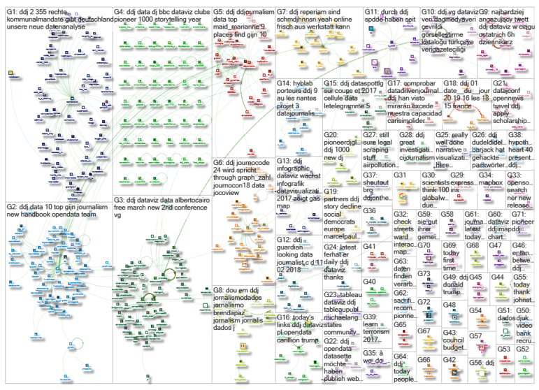
Thanks, once again, to Marc Smith of Connected Action for gathering the links and graphing them.
For a look at Marc Smith’s mapping on #ddj on Twitter, check out this map.

