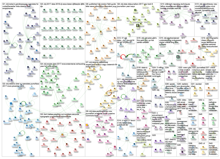
 What’s the global data journalism community tweeting about this week? Our NodeXL #ddj mapping from January 1 to 7 has data journalism and data visualization roundups by @ddjournalism and @flowingdata, podcasts by @datastories and @fabrider, as well as an analysis on prices corresponding with ski resort altitudes by @duc_qn.
Data Journalism 2017 Roundup
Data Driven Journalism recaps the year that was by highlighting the reflections of eight news organisations that used numbers in their reporting, from FiveThirtyEight to Indiaspend.
Some great examples of how data journalism was used over the past year. #journalism #datajournalism https://t.co/7JQJT0zZhy pic.twitter.com/aTWinC2PWQ
— JournalistWorks (@journalistworks) January 3, 2018
Ski Higher, Pay More
The higher up you ski, the more you pay. Duc Quang Nguyen’s analysis for Swissinfo.ch shows that the cheaper ski resorts are the lowest located resorts, which are only sporadically open, usually attract only local customers and offer little infrastructure or accommodation.
Je weiter oben man Skifahren kann, desto mehr bezahlt man. https://t.co/wdqqCzXFE5
— Felix Irmer (@fexi) January 8, 2018
Doing Digital vs Being Digital
In this evergreen piece from last April, David Skok explains how to truly embrace the digital philosophy in journalism — which means defining your editorial and product strategy not by a platform but by the stories, topics, and questions that you choose to pursue for your community, then optimizing those stories for their desired platforms, listening to your readers and adapting.
Understanding what it truly means to be digital is critical for long-term success https://t.co/tYIm4dxFM8 #tech #ddj via @storybench pic.twitter.com/06Y6pihwyO
— Stephanie Neal (@StephanieJNeal) January 1, 2018
Guide to Pie Charts
Lisa Charlotte Rost will be writing “Best Practice Guides” for common chart types. Here’s the first piece on when and how best to use pie charts.
I’m so excited to write and illustrate “best practice” guides for all common chart types. Here’s the first one about pie charts: https://t.co/sl2Qosey05 Let me know if you want me to add/delete tips or links! /cc @eagereyes pic.twitter.com/B865OxHyB4
— Lisa Charlotte Rost (@lisacrost) January 3, 2018
Best DataViz in 2017
Statistician Nathan Yau picks his top 10 favorite data visualizations from 2017. It includes an explanation of gerrymandering in comic form by Olivia Walch, a graphic analysis of the link between handwriting and culture by Thu-Huong Ha and Nikhil Sonnad, and a graphic on solar eclipses by Denise Lu.
Fun stuff in here — I love the Gerrymandering and Circle Drawing pieces. https://t.co/0nwiNjRYKh #DataViz pic.twitter.com/aODCK9Eojp
— Tom Pacyk (@tompacyk) January 2, 2018
Teaching Data Journalism in Universities
Data journalism lecturer Kayt Davies shares her thoughts on the challenges of training students in data journalism when she and her colleagues all lack the experience of being a data journalist to draw on.
As #journalism evolves, how do J-schools keep pace? Dr Kayt Davies discusses the challenges that universities face to teach data journalism: https://t.co/2W2kTEk3CE #ddj
— DataDrivenJournalism (@ddjournalism) January 2, 2018
DataViz Podcast
In this podcast episode, Enrico Bertini and Moritz Stefaner get an overview of the happenings in dataviz around the world by speaking to Spe Chen from China; Pia Faustino from Philippines; Pinar Dag in Turkey; Justin Yarga from Burkina Faso; Harry Stevens in India; and Qristina Parjiani from Georgia.
It’s a brand new year! In our annual recap, we hear the 2018 data viz wishes of @spepechen @piafaustino @pinardag @y_jus @Harry_Stevens and more from countries around the world. Listen at https://t.co/v1IOlPfyPx pic.twitter.com/xExCPSFAD4
— Data Stories Podcast (@datastories) January 2, 2018
Data Literacy Conversations
Data is a Team Sport is a series of online conversations held with data literacy practitioners in mid-2017 that explore the ever-evolving data literacy eco-system.
Listen to @SchoolOfData ‘s podcast series on Data is a Team Sport https://t.co/ZroUwLnZ7O
— Open Knowledge Intl (@OKFN) January 3, 2018
A Decade of UK Vacant Homes
More than 11,000 homes in the UK have stood empty for at least 10 years, data from 275 councils showed. The research also showed that just one in 13 councils are making use of empty dwelling management orders – the powers that can be used by local authorities to take over empty properties.
That’s a great shame considering this article and the number of homeless people in this country. https://t.co/GlBjEmWoBC
— Nochum Dewhurst (@NocDewhurst) January 10, 2018
Gender Pay Gap
Six employers changed the gender pay gap data they submitted to the UK government after the Financial Times reported anomalies on its official portal. Employers in the UK have until April 4 to submit pay gap details and must ensure that the information they publish is accurate.
Six employers have changed gender pay gap data they submitted to UK government after FT reported anomalies. https://t.co/TL3TjxrgY3 pic.twitter.com/eIfJAWcsQ2
— Brian Groom (@GroomB) January 7, 2018
Thanks, once again, to Marc Smith of Connected Action for gathering the links and graphing them.
For a look at Marc Smith’s mapping on #ddj on Twitter, check out this map.

