 What’s the global data journalism community tweeting about this week? Our NodeXL #ddj mapping from December 4 to 10 has @Reuters documenting the deplorable living conditions at refugee camps in Bangladesh, Financial Times’ @theboysmithy transforming bad charts into useful ones and the impressive work of the 2017 @infobeautyaward winners.
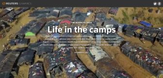
Close Up: Rohingya Refugee Camps in Bangladesh
Health experts say overcrowding, poor sanitation and limited health care in the Rohingya refugee areas of Bangladesh is a “recipe for disaster.” Reuters brings readers a closer look at life in these camps, with satellite imagery and data analysis.
800,000 Rohingya fleeing Burma’s ethnic cleansing are now crammed into world’s most densely-populated refugee settlement in Bangladesh that’s half the absolute minimum size required – this is what it looks like https://t.co/eSpVFjaWoz pic.twitter.com/akyujWe1yO
— Gerry Simpson (@GerrySimpsonHRW) December 4, 2017
Chart Makeover
Which bad business charts rile you the most? The Financial Times’ data visualization editor Alan Smith takes you through the steps of transforming a bad chart into a useful one. FT also invites readers to upload your own favorite bad graphics in the comments. Do your worst.
This is one of the best makeover ‘splainers I’ve seen in a while. Great FT Chart Doctor article by @theboysmithy https://t.co/BaFFX1v21U pic.twitter.com/yGxRqg0pis
— hrbrgrnch (@hrbrmstr) November 29, 2017
The Winners: Information is Beautiful Awards
This is a great place for data visualization inspiration. Check out the winners of the 2017 Kantar Information is Beautiful Awards.
Discover the impressive WINNERS of our 5 special prizes, including Best Studio & Outstanding Individual. ft. @densitydesign @ERGO_Hestia @datachloe @NadiehBremer @JoryFleming @morgenpost and more https://t.co/MUbGqUNMwJ pic.twitter.com/pFIfg50XdV
— Kantar IIB Awards (@infobeautyaward) December 12, 2017
Guardian’s Year of Visuals
A summary of the The Guardian’s biggest data visualization projects this year, from visualizing the debris for the missing Malaysian flight MH370 to the costs of Brexit.
2017 in Guardian Visuals: a thread of our biggest 📷 🌍 📈 projects of the year pic.twitter.com/ivbU89Ih9x
— Guardian Visuals (@GuardianVisuals) December 1, 2017
Disneyfication of Football
Financial Times takes a deep look at Manchester City and the “Disneyfication” of football. The team’s Arab owners are developing a business model based on a global network of clubs that could upend the sport — and its young footballers could emerge as initial proof that the business model is paying off.
NEW with @muradahmed: a deep-dive into Man City’s efforts to become a super-team, both off and on the pitch
Featuring analysis by @EveryTeam_Mark & @EuanDewar of how City’s use of space & incisive passing bring them alongside Guardiola’s other elite teams https://t.co/Unz1w3OmqH pic.twitter.com/caotW2eNmt
— John Burn-Murdoch (@jburnmurdoch) December 8, 2017
Collaborative Data Journalism Platform
Looking for a collaborative platform for journalists to analyze and visualize data? Workbench makes it easy to assemble data scraping, cleaning, analysis and visualization tasks without any coding. It began at Columbia Journalism School and you can sign up for private beta now.
“Data Journalism Made Easier, Faster, and More Collaborative” by .@cjworkbench https://t.co/5J485FzUps #ddj #vg #dataviz
— Pınar DağⓋ (@pinardag) December 4, 2017
The Rise of the Megafarm
An investigation by The Bureau of Investigative Journalism in partnership with The Guardian discovered that there were now nearly 800 animal “megafarms” throughout the UK. The largest of them house more than a million chickens, 20,000 pigs or 2,000 dairy cows in sprawling factory units where most animals are confined indoors.
Worth having a look!
The rise of the “megafarm”: How British meat is made by @TBIJ #ddj #DJUK17 https://t.co/ZJPby18GvL— Carlapedret (@Carlapedret) December 5, 2017
Part-Time Data Journalism Course
The post graduate certificate in data journalism at the UK’s Birmingham City School of Media takes place over eight months and is designed for those working in the industry who wish to gain accredited skills in data journalism but who cannot take time out to study full time or don’t want a full masters.
Morning! Today! I’m! announcing! a part time PGCert in Data Journalism… 🎉 https://t.co/m4WbtKY50f #ddj pic.twitter.com/vjgWF6Vsrn
— Paul Bradshaw (@paulbradshaw) December 7, 2017
Approach to Data Journalism Through R
Spiegel Online’s data journalist Patrick Stotz shared tips on #rstats and data journalism at a Hamburg R Users meetup.
It was great to have @PatrickStotz @rusershamburg #meetup Here are his slides on #rstats and data journalism #ddj https://t.co/cxEgQAA5E5 #dataviz #datajournalism #data4good #OpenData pic.twitter.com/4bgCckfUdR
— Alireza Shahbaghi (@aliraiser) December 10, 2017
Public Transport Data in West Midlands, England
West Midlands Data Discovery Center gathers highways, rail, construction, freight/haulage and public transport industries data on one platform.
Useful resource for West Mids data journos – making impenetrable transport data accessible #ddj https://t.co/hjWxhRoqsY
— Pete Sherlock (@petesherlock79) December 8, 2017
Thanks, once again, to Marc Smith of Connected Action for gathering the links and graphing them.
For a look at Marc Smith’s mapping on #ddj on Twitter, check out this map.