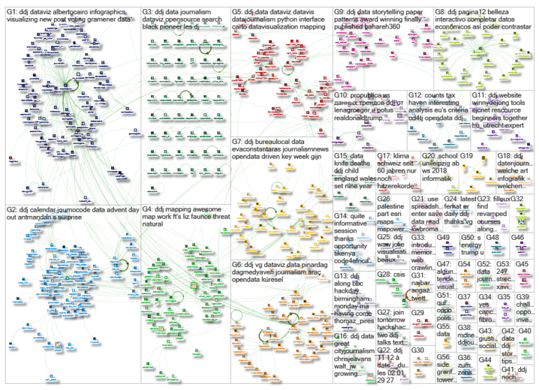
 What’s the global data journalism community tweeting about this week? Our NodeXL #ddj mapping from November 27 to December 3 has @journocode‘s festive data-driven advent calendar with tutorials and interviews, @FT mapping cities at risk of natural disasters affecting property prices, and a #VisualizationUniverse by Google News Lab and Adioma.
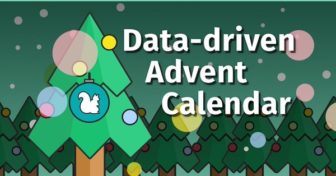
Data-Driven Advent Calendar
Countdown to Christmas with Journocode’s delightful advent calendar and get a data-driven surprise everyday till December 24th!
Here is an online journalism advent calendar that provides useful tips and tools for data-driven stories #journalism https://t.co/9tuEtagml9
— frayintermedia (@frayintermedia) December 3, 2017
Natural Disasters: Property Price Time Bomb
Property prices continue to rise in at-risk cities, but how long will that last? Financial Times tackles the story of the “cascading effects” of storms, earthquakes, wildfires and more natural disasters that may influence real estate.
Awesome map work by @FT‘s Liz Faunce, mapping threat of natural disaster to property prices https://t.co/pAMaZiShUJ #ddj #dataviz #gistribe pic.twitter.com/YFH9Php5mL
— Steven Bernard (@sdbernard) November 29, 2017
Visualizing… Visualizations
An interactive visualization about the world of visualizations itself. Google News Lab and Adioma catalogued all recognized visualization types and then compared them by search interest to see which ones are most popular. More information here.
#VisualizationUniverse from @annavitals, @albertocairo & team is beautiful, educational, and fascinating all at once. Will definitely be exploring this in great detail over the coming days: https://t.co/BkptGXqfgG #DataViz pic.twitter.com/snEG5PAVsR
— Hannah Wilber (@WilberIsBananas) November 29, 2017
How Data Journalism Will Save Open Data
Technologist Giuseppe Sollazzo believes that data journalism is keeping the flame of transparency burning and enabling operational transformation — and in doing so, it is saving open data.
“Data Journalism will save Open Data” by .@puntofisso https://t.co/2Wj8qbbaFq #ddj #vg #dataviz #opendata #açıkveri pic.twitter.com/bNAKKfAbsL
— Pınar DağⓋ (@pinardag) November 27, 2017
Apps that Tell Open Data Stories
At the “EU Datathon 2017,” teams were challenged to create applications that showcased stories related to three key priorities for the European Union: jobs, growth and investment; the digital single market; and democratic change. Here are the top 3 apps.
3 winning apps that used @EU_opendata to showcase stories about key EU priorities: https://t.co/yIoj0xhEa6 #ddj #opendata
— DataDrivenJournalism (@ddjournalism) November 27, 2017
Visualizing Senate Voting Similarities
Gramener, a data science firm based in India published a visualization of voting similarities in the Senate. The tool allows you to find out the similarity in voting patterns of senators of the 115th Congress.
Visualizing voting similarities in the Senate https://t.co/NTxU5MoK0t by @Gramener #dataviz #infographics #ddj pic.twitter.com/en224N88YM
— Alberto Cairo (@albertocairo) November 26, 2017
Trump’s Tweet Density
Dan Snow plotted Trump’s tweets by time and density and compared it to the airtime of Fox & Friends, a daily morning conservative news/talk program. Interestingly, Trump tweets a lot during Fox & Friends airtime in 2017.
Trump tweet density vs Fox & Friends airtime visualized by Dan Snow
Source code: https://t.co/RFnhRYWevc #dataviz #opensource pic.twitter.com/FDg41cgHwx
— Datavis Daily (@DatavisDaily) November 30, 2017
Data Journalism Dictionary
Navigating the field of data journalism with its unique terminology can be hard. Journocode’s Data Journalism Dictionary explains technical terms from fields like programming, web development, statistics and graphics design in a way that every journalist and beginner can understand them.
Ahead of #DJUK17 tomorrow here are a couple of data things that I love – @ Journocode’s data dictionary https://t.co/O1Wl92pXgJ
— Karrie Kehoe (@KarrieKehoe) December 4, 2017
Visualization at Eurostat
Data visualization expert Alberto Cairo gives an insight into the cool data stuff being produced at Eurostat, a platform for European statistics.
New post: #dataviz #infographics #ddj at @EU_Eurostat: https://t.co/hS2HGyiu9y pic.twitter.com/E8psW3gASx
— Alberto Cairo (@albertocairo) November 28, 2017
Python Package for CARTO
CARTO released CARTOframes — a Python package for interacting with CARTO that’s built specifically with data scientists in mind. It allows one to create data-driven maps without leaving the Python environment.
CARTOframes, our new #Python interface package, brings #LocationIntelligence to #datascience. Learn more in our new product blog post:https://t.co/gryrQbl8m1
— CARTO (@CARTO) November 30, 2017
Thanks, once again, to Marc Smith of Connected Action for gathering the links and graphing them.
For a look at Marc Smith’s mapping on #ddj on Twitter, check out this map.