The field of data visualization is constantly changing as new technologies and techniques push the boundaries of data design, and new devices make demands of data visualization experts.
Lena Groeger, an investigative journalist and developer at ProPublica, and Jane Pong, a data visualization journalist at the Financial Times, shared their thoughts on current data visualization trends with delegates at the 2017 Global Investigative Journalism Conference in Johannesburg last week.
1. Playing with Maps
Groeger said that current visualization had moved well beyond Google Maps and there was much more experimentation happening. “There is now so much more you can do with maps to tell stories. For example, the maps by Tim Wallace that illustrate what the US would look like depending on how the country voted.”
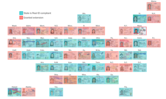
Other designers are experimenting with variations on cartograms — maps in which data is used to inform what each place looks like. It’s a popular technique for election-related maps but there are many other ways cartograms can be used. A good example of this, said Groeger, was the clever way the Washington Post used driving licenses in a cartogram map to illustrate new license requirements.
2. Bespoke Datasets
Pong said that while there was a growing number of open datasets available to journalists, which is good for data visualization, it does “mean that every other journalist has access to the same datasets. To stand out and be unique we have to create our own datasets. One way to create your own dataset is to combine multiple datasets, but sometimes it is better to just create your own unique datasets.”
This is what the FT did for a data-driven story and visualization on China’s panda trade.
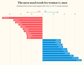
Another technique which is increasingly popular, Pong said, to turn “non-standard data” into a usable dataset. An example of this is The Pudding’s movie dialogue visualization. The project analyzed 2000 screenplays and broke the lines down by gender to create a visual representation of movie scripts.
3. You Draw It
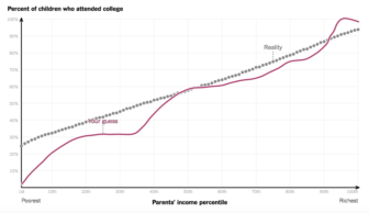
One of the most interesting visual techniques to engage readers, said Groeger, is the “You Draw It” chart in which readers are asked for input before the data is revealed to them. “It doesn’t just present the data to them so they can hover over the data points. It encourages them to think about the data first, even without knowing the underlying data.”
An example is The New York Times‘ feature on how family income affects children’s chances of going to college. Readers are asked to draw a line chart of the relationship between family income and college attendance. Once they’ve drawn their own line the true data is revealed to the reader. In an interesting addition, readers are also able to see the predictions of other readers and how they compare.
4. Emotive Storytelling
“We don’t often put data and emotion together in one sentence … but the dichotomy between data and emotion is largely false,” Pong said. It is often a good technique to use data visualization to appeal to people’s emotions to get them to identify with the subjects, she said. A good example of this is “Stories Behind a Line” by Federica Fragapane and Alex Piacentini, a visual narrative which traces the routes followed by six asylum seekers on their way to Italy. “It’s just data, but it’s presented with a lot of detail and in a series of steps which encourages the reader to engage with the stories,” said Pong.
Similarly, The Washington Post‘s feature on the gender pay gap takes a relatively abstract set of data and visualizes it in a way that makes the realities of the data obvious. And the FT‘s Uber game invites readers to identify with Uber drivers as they play their way through the life of a worker in the gig economy. “It allows them to put themselves in the shoes of the drivers,” said Pong, who added that most people played the game all the way through.
5. Clever Responsive Design
Increasingly, data visualization designers need to think about how their work appears on mobile devices, said Pong. One technique for doing this is to offer a full, detailed visualization for desktop and then break the graphic into a base graphic repeated multiple times with different data for mobile.
National Geographic used this technique in its feature on Scotland’s moors. The desktop version has a highly-detailed map of Scotland with multiple layers of data. On mobile the map is broken into multiple base maps, each with different data.
The FT‘s One Belt, One Road features use a different technique. The desktop version of the feature splits the screen vertically and the map on the left changes as the reader scrolls. On a mobile device the map is pinned to the top of the screen and changes as the reader scrolls.
“It’s still very difficult to do visualization on mobile,” says Pong, “and it is still evolving and people are working out new techniques all the time.”
6. Simple, Simple, Simple
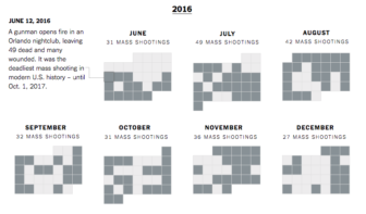
One of the other trends in data visualization was to simplify, said Groeger. “In some ways this may be a reaction to the crazy, complex visualizations that have been coming out. It’s also that simple visualizations often work better on mobile.” One good example of this is is the New York Times‘ editorial on mass shootings in the United States. The graphic is a simple calendar for each month with each day on which a mass shooting occurred highlighted. “A calendar can be a simple but powerful way to visualize data,” said Groeger. “This was an editorial by the Times … and shows that you can condense your data into one chart and still make your point.”
7. Small Multiples and Gifs
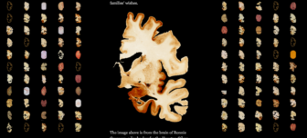
Small multiples is an interesting way of presenting data visually, said Groeger. “With this technique the same image is repeated over and over again (with different data) so the brain can pick up the slight variations.”
The New York Times‘ feature on brain injuries among football players uses this technique to good effect. The brains of each of 110 football players are displayed side-by-side so variations are easy to see.
While most data visualizations involve complex programming, the humble gif can also be a useful explanatory tool, said Groeger. “Gifs are a simple way to explain concepts in an easily understandable way.” A feature on eggs by Science Mag uses a number of gifs that loop repeatedly and explain concepts like how eggs roll, and how different shapes of eggs have different amounts of calcium.
 Alastair Otter is the managing partner of Media Hack Collective, a data journalism and data visualization initiative based in Johannesburg. He is the former editor and head of editorial innovation at Independent Online, one of Africa’s largest online news sites. At Media Hack, he handles data visualization and the development of online media products.
