 When Rick Feneley’s editor from a prior newspaper approached him about writing a piece about the string of gay hate crimes that plagued Australia’s eastern border, he knew he would be in it for the long haul. After months of research and digging through court documents, the reporter for Australian broadcaster SBS crafted an extensive investigative piece of journalism. But before “The Gay Hate Decades” was published, Feneley was left with one last hurdle: Creating a digital element to accompany his work.
That’s when he teamed up with Ken Macleod, a web developer with SBS, and Gina Mckeon, the head of online content for SBS, to bring his two-dimensional article to life using drone footage, interactive maps and photographs. Storybench spoke with Feneley about the process.
What sparked your interest in this topic?
Well it’s a bit prosaic in this case because I often chase my own angles, but in this case the editor of the Sydney Morning Herald had read, as I had, a column in the newspaper which passionately advocated for these old gay hate cases that had been inadequately investigated. The editor said take as much time as required — they said months if it takes it — to investigate.

Did you find it difficult to get your ideas across?
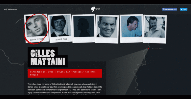
The great frustration with this story is that there were a lot of (deaths). We tried to do 80 (many of which were solved cases) but of those there were 30 (that we focused on); I think we only had pictures of eight of the men…roughly. So that made presentation quite difficult and we had to come up with atmospheric pictures or video of cliff-top areas where a lot of the crimes or deaths happened.
Is the final product what you were looking for?
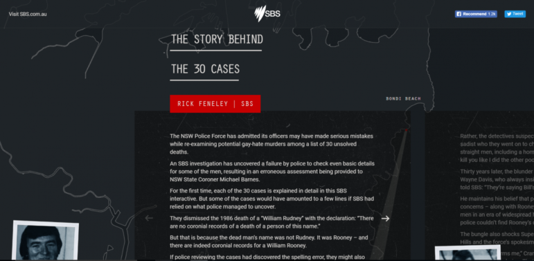
Well it certainly morphed. I think they originally wanted me to do all 80 of the cases — vignettes on each case which is almost like a little record of all the cases — but I said “well that’s really not plausible.” It’s also that there really isn’t much known about a lot of the cases to make it interesting. So I just said, what’s interesting about 30 of the definitely unsolved cases? That is where I thought all of the attention should be and that is how it evolved.
Were there things you wish you could’ve implemented?
Have a look for the Rosendale story. I think that story ended up as a subsidiary story because Alan Rosendale didn’t die, so he certainly wasn’t one of the 30 deaths. So the story was much bigger than the 30 unsolved cases. There were stories like that which would’ve been good if you could build on them.

How difficult was it to bring the the artistic element into the piece?
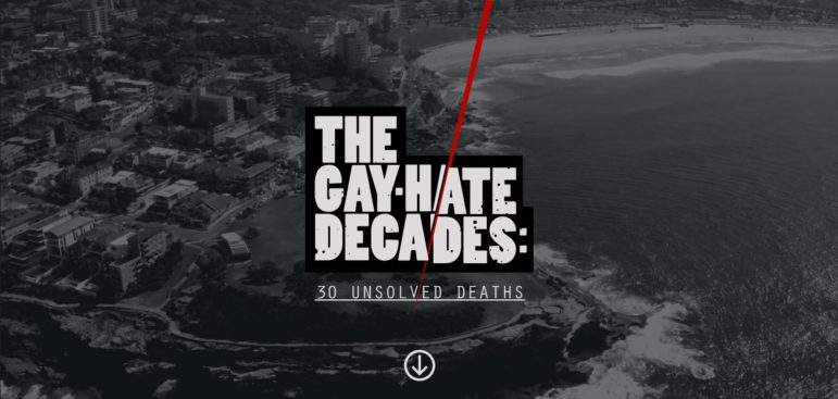
Well, I want to give most, if not all the credit there, to Ken Macleod. He and and his team got those beautiful aerial graphics of North Head and South Head. It’s beautiful but it’s very haunting given the subject matter. Young men have been dying in these beautiful locations; it’s sort of ominous.
For a lot of journalists, incorporating all these digital elements might be intimidating.
Well I just think that most good journalism and most good results come from time and effort. So clearly you can’t (do this) if you have to do quick turnarounds. But wherever you can afford the time, the power of the work can be lifted so much with this sort of treatment. So don’t shy away from the hard yards, do the hard work and you get the reward.
 This post first appeared on the Storybench website and is cross-posted here with permission.
Danae Bucci is a journalism student at Northeastern University.
