 What’s the global data journalism community tweeting about this week? Our NodeXL #ddj mapping from October 23 to 29 has @fedfragapane and @piaaaac visualizing six asylum seekers’ routes, @Recode breaking down the Gates Foundation’s philanthropic contributions and @lisacrost offering tips on how to choose a color palette for choropleth maps.
Visualizing Asylum Seekers’ Routes
Information designers Federica Fragapane and Alex Piacentini created “The Stories Behind a Line,” a visual narrative of six asylum seekers’ routes from their homelands to Italy. Here, they share how they developed the project.
The Stories Behind a Line: A visual narrative of six asylum seekers’ routes to Italy https://t.co/TyMN4I8Ame via @fedfragapane pic.twitter.com/cyoaFZTeMs
— diplomacy data (@diplomacydata) October 31, 2017
Where Gates Foundation Grants Went in 2016
As of the end of 2016, the Bill & Melinda Gates Foundation had given away $41.3 billion in grants. Recode‘s data editor Rani Molla breaks down the foundation’s allocation of $4.6 billion in grants last year.
.@Recode wishes @BillGates a happy birthday by using #PowerBI to show where Gates Foundation spends their money https://t.co/xJCgK2v2fO
— Power BI (@MSPowerBI) October 30, 2017
Expert Environmental Data Reporting
What is the best way of reporting on data related to the environment? Where do you find the data in the first place? How do you make it relatable to the public? Marianne Bouchart finds out from seven environmental data experts.
A data journalist’s microguide to environmental #data https://t.co/I65Q0hXn90 #journalism pic.twitter.com/QSuSrxS6hb
— Advocacy Assembly (@Advocassembly) October 27, 2017
12 Ways to Become a Competent DataViz Thinker
Jorge Camoes, author of Data at Work, shared 12 ideas to become a competent data visualization thinker. He stresses that a visualization usually fails not because there are too many data points but because the author doesn’t understand the data or doesn’t care about the message.
Here’s @camoesjo blog about #data #visualization #dataviz from last week’s presentation.#Analytics #AI #ML #Statshttps://t.co/JIlqd5frLg
— Bernard McKeown (@BernardMcKeown) October 30, 2017
Choosing A Graph Color Palette
The colors we choose have a huge impact on our maps: How it is perceived, how well our statement is communicated and how honestly we present the data. In this piece, Lisa Charlotte Rost explains how to choose a color palette for choropleth maps and what the different options means.
You’ve never really understood color palettes for Choropleth maps? You’re not alone. @lisacrost explains them here: https://t.co/VQ7DaJTi7y pic.twitter.com/PScQEoknpC
— Datawrapper (@Datawrapper) October 27, 2017
Infographic: User Experience Wheel
In Magnus Revang’s infographic, he categorizes user experience as a series of phases — findability, accessibility, desirability, usability, credibility and usefulness. Numerous factors contribute to the phases of user experience, and the model shows 30 such factors.
The #UserExperience Wheel. #GrowthHacking #UX #DigitalMarketing #SMM #SEO #CX #StartUp #dataviz MT @JacBurns_Comext @jblefevre60 @Fisher85M pic.twitter.com/qRIP9PMTvR
— Social Fave (@Socialfave) October 23, 2017
When Data Journalism Meets Civic Tech
Stefan Baack’s article explores the entanglements between data journalists and civic technologists due to interlocking practices and complementary values and ambitions. He believes we should pay more attention to such entanglements and the implications for increasingly datafied publics.
The entanglements between #ddj and #civictech – how do they overlap and what are the implications? My latest study: https://t.co/3B9e5jIrev pic.twitter.com/cqxxQBlPLr
— Stefan Baack (@tweetbaack) October 13, 2017
Myanmar Crisis Visualized
The Irrawaddy visualized this crisis involving a Myanmar minority in a series of charts, covering the death toll, exodus and refugee locations.
Rakhine crisis in numbers#Myanmarhttps://t.co/8gothpKCZJ pic.twitter.com/5phY8OWWTI
— The Irrawaddy (Eng) (@IrrawaddyNews) October 24, 2017
Data Science Cheat Sheets
DataCamp has a collection of data science cheat sheets, from Python to Jupyter.
A useful collection of #datascience cheat sheets https://t.co/rI4S40kh4p #ddj pic.twitter.com/vM7FdESUAd
— Sascha Venohr (@venohr) October 23, 2017
No Data Journalism Revolution (Yet)
An analysis of international data journalism projects nominated for awards over four years reveals little change in the field. Researchers Wiebke Loosen, Julius Reimer and Fenja de Silva-Schmidt note in a paper that data journalism still mostly covers politics, is still labor-intensive and requires big teams, it’s still mostly done by newspapers and still primarily uses “pre-processed public data.”
How much has #ddj changed since 2013? Not much, new research finds: https://t.co/fIOLkIzUBP #dataviz #journo #data
— DataDrivenJournalism (@ddjournalism) October 26, 2017
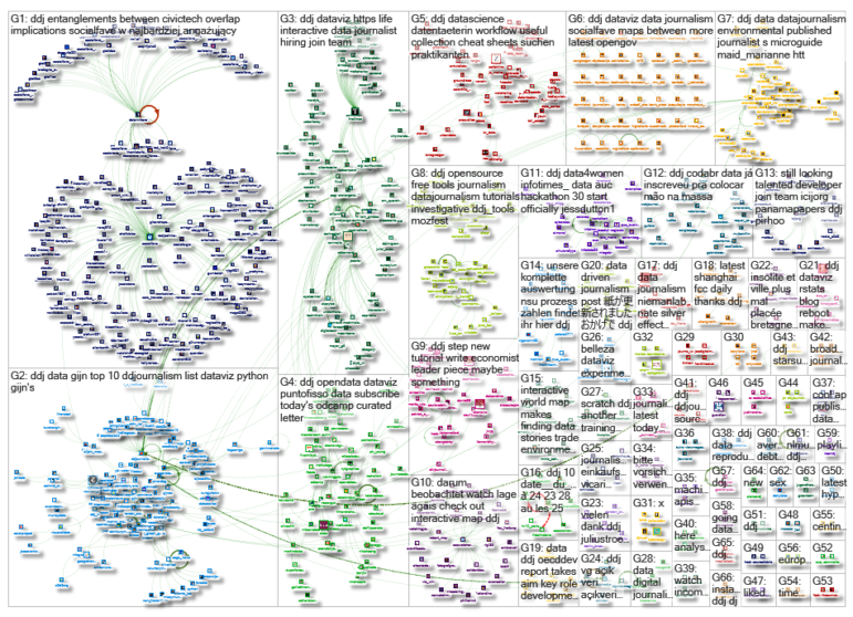
Thanks, once again, to Marc Smith of Connected Action for gathering the links and graphing them.
For a look at Marc Smith’s mapping on #ddj on Twitter, check out this map.