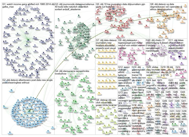
 What’s the global data journalism community tweeting about this week? Our NodeXL #ddj mapping from Sept 4 to 10 has @FastCoDesign bringing the #EndtheRainbow argument to the fore, @puddingviz analyzing driving times to abortion clinics in the US and @nsuwatch dissecting a trial involving a German terrorist organization by the numbers.
Rainbow Colour Scheme: Yay or Nay?
As meteorologists raced to map Hurricane Harvey’s rainfall, the National Weather Service realized that its current graphic standards couldn’t communicate the extent of the deluge. It added a very light purple to the deeply saturated rainbow color scale of its graphics, which proved to be a controversial decision among the climate science and data visualization community.
#endtherainbow on @FastCoDesign https://t.co/OkpZyHnbk8 Features @kennethfield @rsimmon @edhawkins @adamrpearce, so a must read pic.twitter.com/NJTJR6qcmu
— Maarten Lambrechts (@maartenzam) September 8, 2017
Abortion Access
The Pudding set out to quantify access to US abortion clinics by measuring what really affects people: how long it takes to drive there. They found that for some people, round-trip travel time to the nearest abortion-providing clinic can be about nine hours.
People told me I was crazy when I wanted to map abortion deserts. This is the most important thing I’ve worked on: https://t.co/lUDFLyiIp3 pic.twitter.com/3bwN56v6bv
— Matt Daniels (@matthew_daniels) September 7, 2017
NSU Trial Statistics
Since May 2013, the NSU trial, a trial against five individuals connected to the National Socialist Underground — an extreme-right terrorist organization in Germany — and the NSU murders, has been running. With almost 600 witnesses and experts interrogated and nearly 250 submissions over four years, NSU Watch breaks down the trial by numbers.
Der #NSU-Prozess in Zahlen – Wir haben 374 Tage Beweisaufnahme ausgewertet: 596 Geladene Personen, 248 Beweisanträge https://t.co/zk1KZl5i9y pic.twitter.com/RGHyFHdGgb
— NSU Watch (@nsuwatch) September 10, 2017
Maps Based on Cones of Uncertainty
In predicting paths of hurricanes, maps based on cones of uncertainty have been prevalent. Data expert Alberto Cairo explains how this can be quite problematic as people tend to see it as the size of the hurricane and not the possible range of paths the center of the hurricane can take. Also, people do not realize that the hurricane could very well occur well outside of the cone.
Great undressing of problematic ‘cone of uncertainty’ by @albertocairo and @ChristiansenJenhttps://t.co/1txDrysv9Lhttps://t.co/MM8jJF81iy pic.twitter.com/LwXvqQrrK7
— Joshua Stevens (@jscarto) September 7, 2017
Journocoding Tools
From Excel Geocoding Tool to Placekitten, Journocode has neatly collated 40 tools for all your journocoding needs. Find what you need by using their useful filters: purpose, platform, cost, skill level and type.
This collection of 40 data journalism tools by @journocode can be also helpful for researchers & analysts: https://t.co/OPm6MaGtmk
— Johannes Saal (@johannes_saal) September 7, 2017
Data Needs Context
In reference to Breitbart’s story titled “2,139 DACA Recipients Convicted or Accused of Crimes Against Americans,” data expert Alberto Cairo illustrates how presenting a single data point is meaningless without its context.
Great example & reminder of the importance of context from @albertocairo: https://t.co/lS1LJmTsQg #dataviz pic.twitter.com/BceE27yPdu
— Cole Knaflic (@storywithdata) September 9, 2017
Balochistan Population Census
Data analysis of district-wide census data in Pakistan reveals that there is no major change in the ethnic balance of population in Balochistan, namely between the Baloch and Pashtun. It did expose, however, that Balochistan has the biggest gender imbalance in the country among all provinces.
Repost https://t.co/VwetCyAJSD
— Balochistan Voices (@Bal_Voices) September 6, 2017
#DHDJ Miami Cancelled
In light of Hurricane Irma, the Digital Humanities and Data Journalism Symposium this week has unfortunately been cancelled.
1) We’ve had to cancel the https://t.co/0R8f4iVuiY conference until further notice. Impact on Miami is very likely to be big pic.twitter.com/4HebL8noRy
— Alberto Cairo (@albertocairo) September 9, 2017
#DistractedBoyfriend Memes
In case you missed this, data journalist Xaquín González Veira’s 10 hilarious dataviz-related #DistractedBoyfriend styled memes are still tickling data journalists’ funny bones. Check out how he chooses designing for desktop over mobile and experimenting over well tested formats despite knowing the pitfalls.
😂 Visual editor @xocasgv meme-ified his 10 professional sins https://t.co/C9qqtDWzt8 pic.twitter.com/I1TxnTS0Cd
— Maarten Lambrechts (@maartenzam) September 5, 2017
The Broken US Economy in One Chart
Income inequality hits home in this chart created by NYT. The affluent have received significant raises in recent decades compared to the poor and middle class. This overwhelming reality of the rich getting richer is creating a huge gap between the super-rich and everyone else.
How income gains in the US have shifted to the rich, 1980–2014https://t.co/LGK2yWE66i … pic.twitter.com/qbKlFULGbH
— Scott Galloway (@profgalloway) September 8, 2017
Thanks, once again, to Marc Smith of Connected Action for gathering the links and graphing them.
For a look at Marc Smith’s mapping on #ddj on Twitter, check out this map.

