 Editor’s Note: The Verification Handbook for Investigative Reporting is a new guide to online search and research techniques to using user-generated content and open source information in investigations. Published by the European Journalism Centre, a GIJN member based in the Netherlands, the manual consists of ten chapters and is available for free download. We’re pleased to reprint below chapter 5, by investigative journalist Giannina Segnini.
Never before have journalists had so much access to information. More than three exabytes of data — equivalent to 750 million DVDs — are created every day, and that number duplicates every 40 months. Global data production is today being measured in yottabytes. (One yottabyte is equivalent to 250 trillion DVDs of data.) There are already discussions underway about the new measurement needed once we surpass the yottabyte.
The rise in the volume and speed of data production might be overwhelming for many journalists, many of whom are not used to using large amounts of data for research and storytelling. But the urgency and eagerness to make use of data, and the technology available to process it, should not distract us from our underlying quest for accuracy. To fully capture the value of data, we must be able to distinguish between questionable and quality information, and be able to find real stories amid all of the noise.
One important lesson I’ve learned from two decades of using data for investigations is that data lies — just as much as people, or even more so. Data, after all, is often created and maintained by people.
Data is meant to be a representation of the reality of a particular moment of time. So, how do we verify if a data set corresponds to reality?
Two key verification tasks need to be performed during a data-driven investigation: An initial evaluation must occur immediately after getting the data; and findings must be verified at the end of the investigation or analysis phase.
A. Initial Verification
The first rule is to question everything and everyone. There is no such thing as a completely reliable source when it comes to using data to make meticulous journalism.
For example, would you completely trust a database published by the World Bank? Most of the journalists I’ve asked this question say they would; they consider the World Bank a reliable source. Let’s test that assumption with two World Bank datasets to demonstrate how to verify data, and to reinforce that even so-called trustworthy sources can provide mistaken data. I’ll follow the process outlined in the below graphic.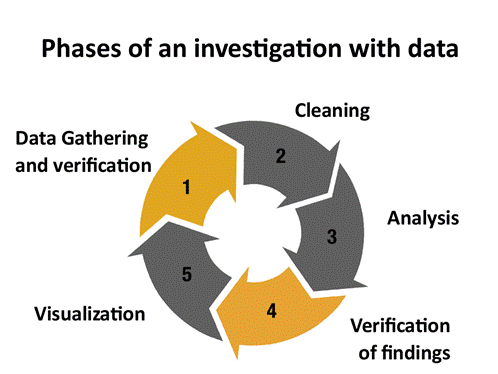
1. Is the data complete?
One first practice I recommend is to explore the extreme values (highest or lowest) for each variable in a dataset, and to then count how many records (rows) are listed within each of the possible values.
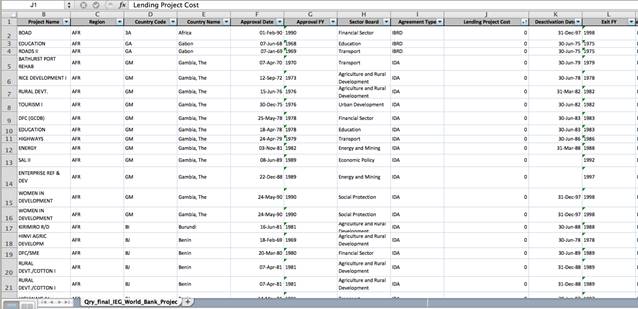
For example, the World Bank publishes a database with more than 10,000 independent evaluations performed on more than 8,600 projects developed worldwide by the organization since 1964.
Just by sorting the Lending Cost column in ascending order in a spreadsheet, we can quickly see how multiple records have a zero in the cost column.
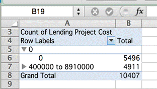
If we create a pivot table to count how many projects have a zero cost, in relation to the total records, we can see how more than half of those (53 percent) cost zero.
This means that anyone who performs a calculation or analysis per country, region or year involving the cost of the projects would be wrong if they failed to account for all of the entries with no stated cost. The dataset as it’s provided will lead to an inaccurate conclusion.
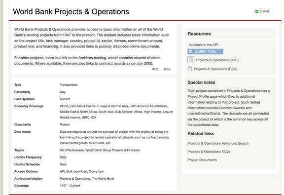
The Bank publishes another database that supposedly contains the individual data for each project funded (not only evaluated) by the organization since 1947.
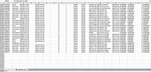
Just by opening the api.csv file in Excel (version as of Dec. 7, 2014), it’s clear that the data is dirty and contains many variables combined into one cell (such as sector names or country names). But even more notable is the fact that this file does not contain all of the funded projects since 1947.
The database in fact only includes 6,352 out of the more than 15,000 projects funded by the World Bank since 1947. (Note: The Bank eventually corrected this error. By Feb. 12, 2015, the same file included 16,215 records.)
After just a little bit of time spent examining the data, we see that the World Bank does not include the cost of all projects in its databases, it publishes dirty data, and it failed to include all of its projects in at least one version of the data. Given all of that, what would you now expect about the quality of data published by seemingly less reliable institutions?
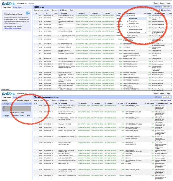
Another recent example of database inconsistency I found came during a workshop I was giving in Puerto Rico for which we used the public contracts database from the Comptroller’s Office. Some 72 public contracts, out of all last year’s contracts, had negative values ($–10,000,000) in their cost fields.
Open Refine is an excellent tool to quickly explore and evaluate the quality of databases.
In the first image below, you can see how Open Refine can be used to run a numeric “facet” in the Cuantía (Amount) field. A numeric facet groups numbers into numeric range bins. This enables you to select any range that spans a consecutive number of bins.
The second image below shows that you can generate a histogram with the values range included in the database. Records can then be filtered by values by moving the arrows inside the graph. The same can be done for dates and text values.
2. Are there duplicate records?
One common mistake made when working with data is to fail to identify the existence of duplicate records.
Whenever processing disaggregated data or information about people, companies, events or transactions, the first step is to search for a unique identification variable for each item. In the case of the World Bank’s projects evaluation database, each project is identified through a unique code or “Project ID.” Other entities’ databases might include a unique identification number or, in the case of public contracts, a contract number.
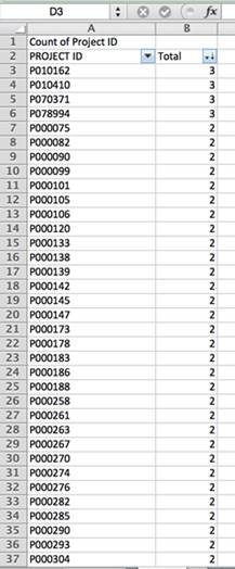
If we count how many records there are in the database for each project, we see that some of them are duplicated up to three times. Therefore, any calculation on a per country, region or date basis using the data, without eliminating duplicates, would be wrong.
In this case, records are duplicated because multiple evaluation types were performed for each one. To eliminate duplicates, we have to choose which of all the evaluations made is the most reliable. (In this case, the records known as Performance Assessment Reports [PARs] seem to be the most reliable because they offer a much stronger picture of the evaluation. These are developed by the Independent Evaluation Group, which independently and randomly samples 25 percent of World Bank projects per year. IEG sends its experts to the field to evaluate the results of these projects and create independent evaluations.)
3. Are the data accurate?
One of the best ways to assess a dataset’s credibility is to choose a sample record and compare it against reality.
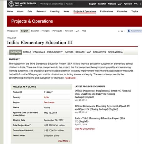
If we sort the World Bank’s database — which supposedly contained all the projects developed by the institution — in descending order per cost, we find a project in India was the most costly. It is listed with a total amount of US$29,833,300,000.
If we search the project’s number on Google (P144447), we can access the original approval documentation for both the project and its credit, which effectively features a cost of US$29,833 million. This means the figure is accurate.
It’s always recommended to repeat this validation exercise on a significant sample of the records.
4. Assessing data integrity
From the moment it’s first entered in a computer to the time when we access it, data goes through several input, storage, transmission and registry processes. At any stage, it may be manipulated by people and information systems.
It’s therefore very common that relations between tables or fields get lost or mixed up, or that some variables fail to get updated. This is why it’s essential to perform integrity tests.
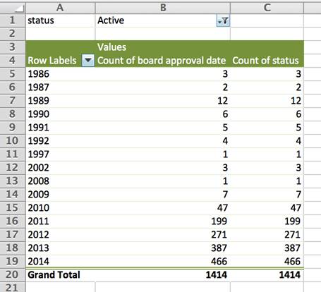
For example, it would not be unusual to find projects listed as “active” in the World Bank’s database many years after the date of approval, even if it’s likely that many of these are no longer active.
To check, I created a pivot table and grouped projects per year of approval. Then I filtered the data to show only those marked as “active” in the “status” column. We now see that 17 projects approved in 1986, 1987 and 1989 are still listed as active in the database. Almost all of them are in Africa.
In this case, it’s necessary to clarify directly with the World Bank if these projects are still active after almost 30 years.
We could, of course, perform other tests to evaluate the World Bank’s data consistency. For example, it would be a good idea to examine whether all loan recipients (identified as “borrowers” in the database) correspond to organizations and/or to the actual governments from the countries listed in the “Countryname” field, or whether the countries are classified within the correct regions (“regionname”).
5. Deciphering Codes and Acronyms
One of the best ways to scare a journalist away is to show him or her complex information that’s riddled with special codes and terminology. This is a preferred trick by bureaucrats and organizations who offer little transparency. They expect that we won’t know how to make sense of what they give us. But codes and acronyms can also be used to reduce characters and leverage storage capacities. Almost every database system, either public or private, uses codes or acronyms to classify information.
In fact, many of the people, entities and things in this world have one or several codes assigned. People have identification numbers, Social Security numbers, bank client numbers, taxpayer numbers, frequent flyer numbers, student numbers, employee numbers, etc.
A metal chair, for example, is classified under the code 940179 in the world of international commerce. Every ship in the world has a unique IMO number. Many things have a single, unique number: Properties, vehicles, airplanes, companies, computers, smartphone, guns, tanks, pill, divorces, marriages…
It is therefore mandatory to learn how to decrypt codes and to understand how they are used to be able to understand the logic behind databases and, more importantly, their relations.
Each one of the 17 million cargo containers in the world has a unique identifier, and we can track them if we understand that the first four letters of the identifier are related to the identity of its owner. You can query the owner in this database. Now those four letters of a mysterious code become a means to gain more information.
The World Bank database of evaluated projects is loaded with codes and acronyms and, surprisingly, the institution does not publish a unified glossary describing the meaning of all these codes. Some of the acronyms are even obsolete and cited only in old documents.
The “Lending Instrument” column, for example, classifies all projects depending on 16 types of credit instruments used by the World Bank to fund projects: APL, DPL, DRL, ERL, FIL, LIL, NA, PRC, PSL, RIL, SAD, SAL, SIL, SIM, SSL and TAL. To make sense of the data, it’s essential to research the meaning of these acronyms. Otherwise you won’t know that ERL corresponds to emergency loans given to countries that have just undergone an armed conflict or natural disaster.
The codes SAD, SAL, SSL and PSL refer to the disputed Structural Adjustment Program the World Bank applied during the ’80s and ’90s. It provided loans to countries in economic crises in exchange for those countries’ implementation of changes in their economic policies to reduce their fiscal deficits. (The program was questioned because of the social impact it had in several countries.)
According to the Bank, since the late ’90s it has been more focused on loans for “development,” rather than on loans for adjustments. But, according to the database, between the years 2001 and 2006, more than 150 credits were approved under the Structural Adjustment code regime.
Are those database errors, or has the Structural Adjustment Program been extended into this century?
This example shows how decoding acronyms is not only a best practice for evaluating the quality of the data, but, more important, to finding stories of public interest.
B. Verifying Data after the Analysis
The final verification step is focused on your findings and analysis. It is perhaps the most important verification piece, and the acid test to know if your story or initial hypothesis is sound.
In 2012, I was working as an editor for a multidisciplinary team at La Nación in Costa Rica. We decided to investigate one of the most important public subsidies from the government, known as “Avancemos.” The subsidy paid a monthly stipend to poor students in public schools to keep them from leaving school.
After obtaining the database of all beneficiary students, we added the names of their parents. Then we queried other databases related to properties, vehicles, salaries and companies in the country. This enabled us to create an exhaustive inventory of the families’ assets. (This is public data in Costa Rica, and is made available by the Supreme Electoral Court.)
Our hypothesis was that some of the 167,000 beneficiary students did not live in poverty conditions, and so should not have been receiving the monthly payment.
Before the analysis, we made sure to evaluate and clean all of the records, and to verify the relationships between each person and their assets.
The analysis revealed, among other findings, that the fathers of roughly 75 students had monthly wages of more than US$2,000 (the minimum wage for a nonskilled worker in Costa Rica is $500), and that over 10,000 of them owned expensive properties or vehicles.
But it was not until we went to visit their homes that we could prove what the data alone could have never told us: These kids lived in real poverty with their mothers because they had been abandoned by their fathers.
No one ever asked about their fathers before granting the benefit. As a result, the state financed, over many years and with public funds, the education of many children who had been abandoned by an army of irresponsible fathers .
This story summarizes the best lesson I have learned in my years of data investigations: Not even the best data analysis can replace on-the-ground journalism and field verification.
 Giannina Segnini is visiting professor at Columbia University Journalism School in New York. Until February 2014, she headed a team of journalists and engineers at La Nacion in Costa Rica, dedicated to delivering investigative stories by gathering, analyzing, and visualizing public databases. Since 2000, she has trained hundreds of journalists in the Americas, Europe, and Asia.
